How To Make 3D Perspective Text

by Steve Tolley

This tutorial shows you some basic techniques using different blending options to get a 3D text that is in perspective, with a nice end result which really stands out.

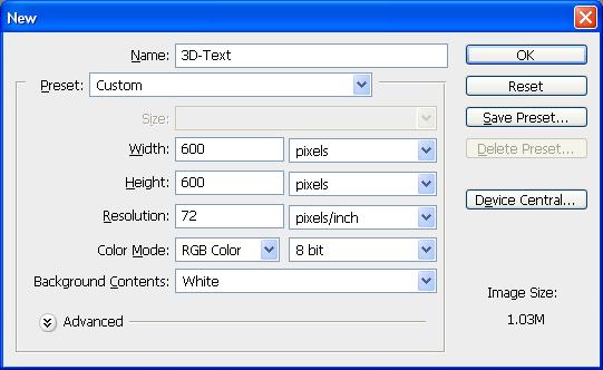
Step 1: First of all create a new document whatever size you like (for this I have used size 500 x 500)

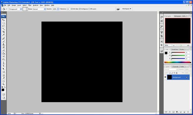
Step 2: Select the gradient tool from the left hand toolbar and set the gradient to the colours and settings as shown below (or you can use your own colours, whichever suits you more)
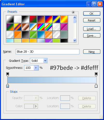
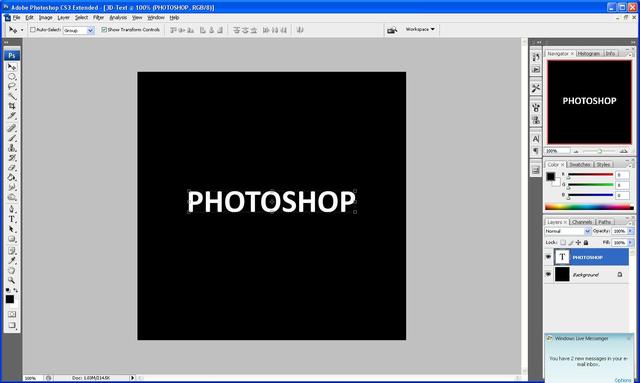
Step 3: With the gradient set choose the text tool and write out the text you want, for best results use a thicker text (I used Century Gothic, set to bold) and then resize to whatever size you need.
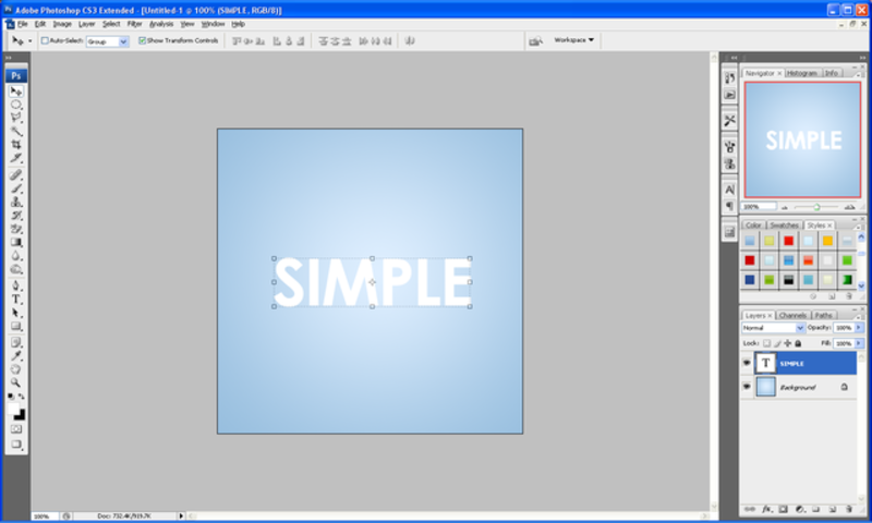
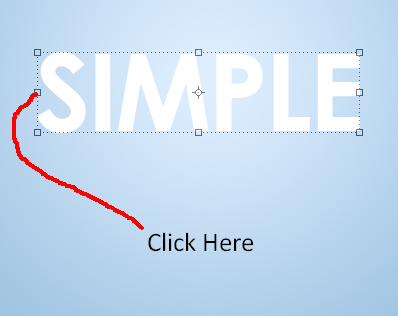
Step 4: Right click on the text layer and choose Rasterize Layer which will convert the text to pixels, now click on one of the little boxes that surround the text like below:
Step 5: Now right click on the text and it should bring up a menu like below, from this choose perspective:

Step 6: Click and hold on the bottom right corner and drag downwards as shown below:

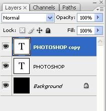
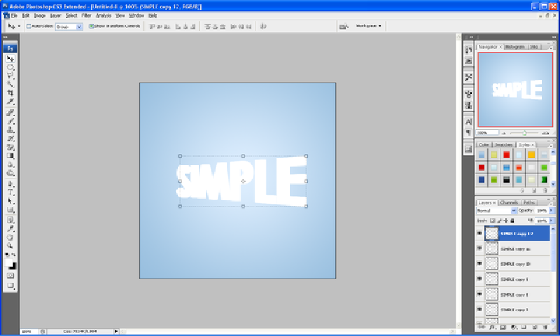
Step 7: When done click the tick button on the top toolbar to apply changes and now simply press CTRL + J (this will duplicate the layer) and press the right arrow once, repeat this as many times as you like or until it looks something like below (I did it 12 times), so this is the order…
CTRL + J, ->,
CTRL + J, ->,
etc…

Result:
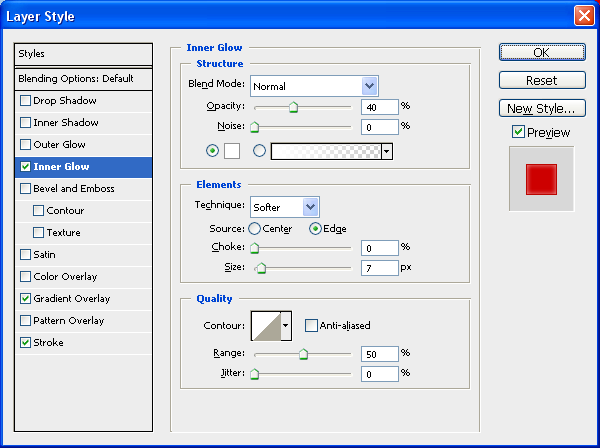
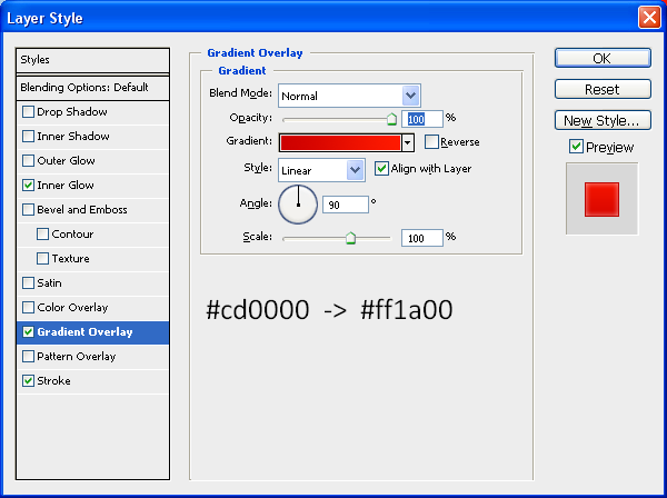
Step 8: Now get the first layer of text again and drag to the top of all the other layers so it is the top layer, this is where we add some colour to the text, double click on the original layer and this will bring up the “Blending Options Menu” when this appears use the settings as shown below: (alternatively you can use your own colours)

Inner Glow:
Gradient Overlay:
Stroke:

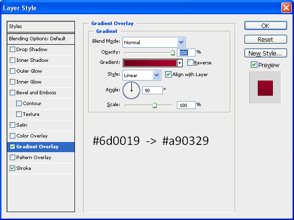
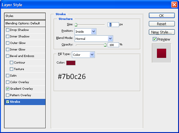
Step 9: Now select all of the other duplicated layers (not the original or the background) and right click and choose “Merge Layers” this will put all of the chosen layers into just one layer, now double click on the merged layer which will again bring up the “Blending Options” now use the settings as below or again you can use your own colours:

Gradient Overlay:
Stroke:
Step 10: To finish this text off simply create a new layer above all of the other layers and choose the “elliptical marquee tool” and make a selection like the one below:
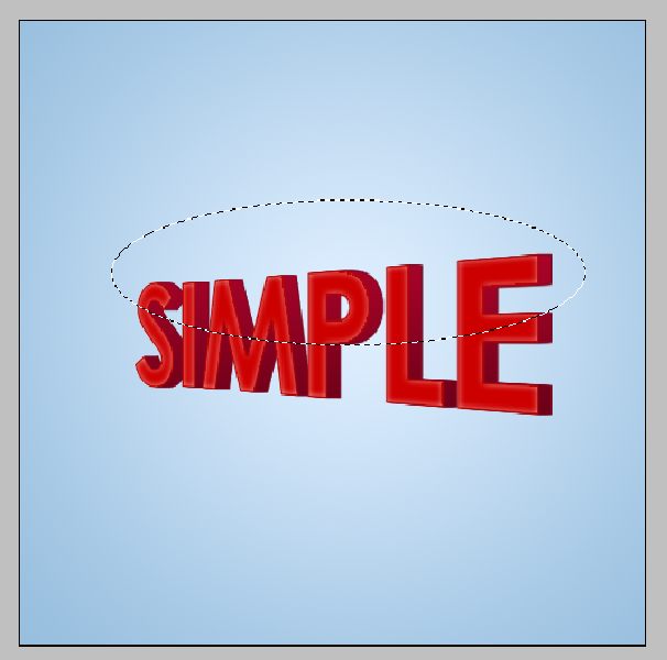
Step 11: Now fill this selection in with white, and now hold CTRL and click in the box next to the layer name on the original layer (this should select the outline of the text) now press CTRL + Shift + I, this will invert the selection and with the new layer still selected press delete this should delete the white that is not wanted and leave you with something similar to below:

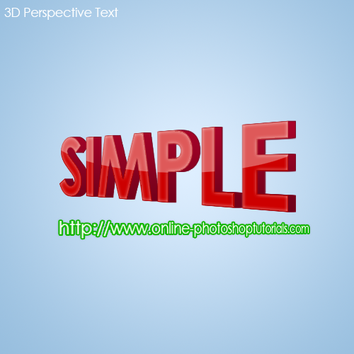
Now set the new layer opacity to 35% using the bar on the top of the layers window which says “Opacity” and then you will have your finished text 3D text perspective:

Finished Result:
If you have had any problems with this tutorial and would like some help then don’t hesitate to contact me either by leaving a comment below or e-mailing me at: stevie489@googlemail.com
How To Use Adjustment Layers - The Basics

by Steve Tolley

This tutorial explains what an “Adjustment Layer” is and also the benefits of using one instead of just adjusting it normally, and how to best use it so that you get the desired effect that you want.

First of all what is an adjustment layer?

Well an adjustment layer is a layer that you create in Photoshop where you can apply any adjustments (e.g. Hue/Saturation, Levels etc…) to the image that you want to manipulate.

What are the benefits of an adjustment layer?

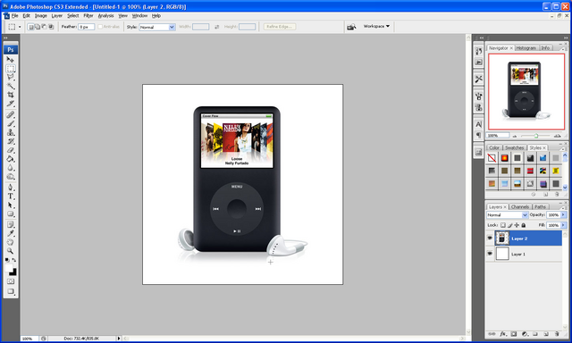
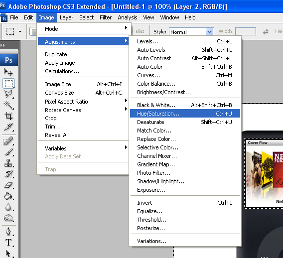
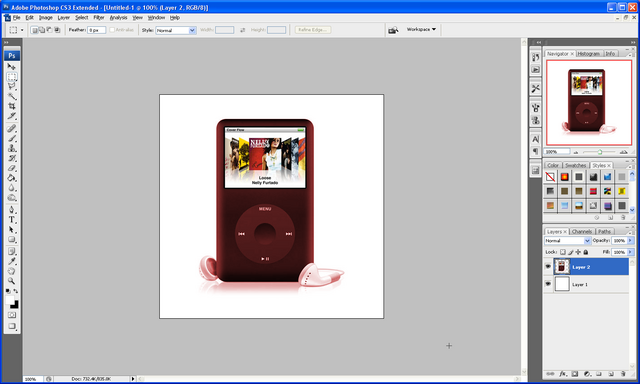
An adjustment layer gives one main benefit when creating your image; say for instance that you wanted to change the colour of this IPod and you were going to use the Hue/Saturation adjustment then you would go to Image > Adjustments > Hue/Saturation and set it to colorize and then play around till you have the colour that you want like below:

IPod:

Adjustment Menu:

Adjusted:

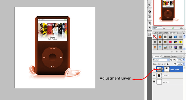
But the problem is that when you get later into your project and you then may decide you don’t like the colour that you set, there is no way in changing it again if you have run out of undo’s, whereas with an Adjustment layer you can do the same Hue/Saturation on a separate layer so it can be deleted later like below, to make an adjustment layer click the black and white circle under the layers window and choose from the options also shown below:

Adjustment Layer Menu:

Adjustment Layer:

As can be seen the adjustment is on a separate layer so therefore can be deleted or hidden if you decide you want to change the colour again later on in the project or if you want to go back to the original.

If you have had any problems with this tutorial and would like some help then don’t hesitate to contact me either by leaving a comment below or e-mailing me at: stevie489@googlemail.com
How To Create Your Own Unique RSS Icon

by Steve Tolley

This tutorial will teach you some key skills that come in handy when creating different things in Photoshop, it’s main aim is to show you how to create your own unique RSS icon, very useful if you have your own website and you want to make it more unique, easy to understand and follow.

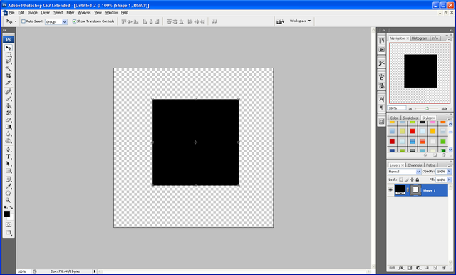
Step 1: Create a new document sized around 500 x 500 and set the background to transparent:

Step 2: Now choose the rectangle tool and hold down shift this will keep the sizes of the sides the same therefore creating a square, make sure this is in the centre of the canvas.

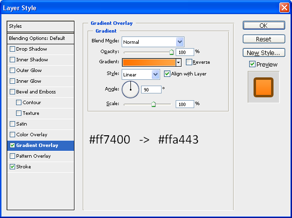
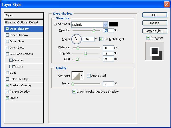
Step 3: Now to get the curved corners you need to refer to my previous tutorial by clicking HERE when you have done this you need to set some blending options (right click on the layer and choose blending options) on the rounded square to get the right colour and effect use the settings below but feel free to play around with the settings a bit to get something unique to you or your website etc…

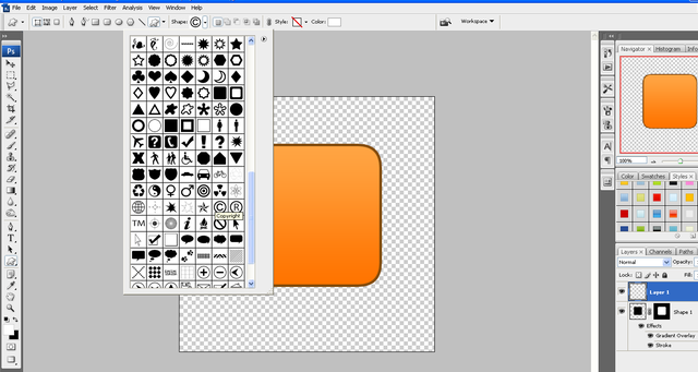
Step 4: Now we need to add the symbol which will create the RSS icon, go to “Custom Shape Tool” and choose the Copyright symbol as shown below:

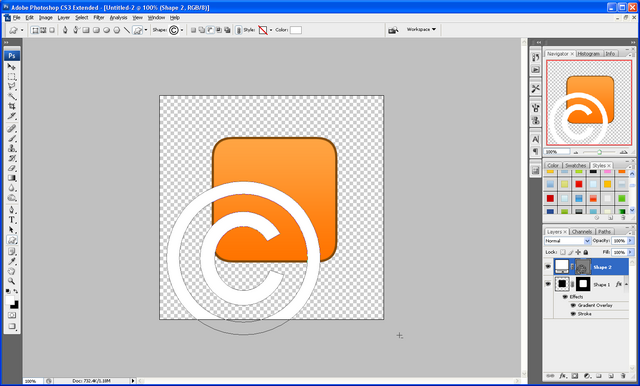
Step 5: Hold down shift and draw the symbol fairly large (don’t worry if it goes off the canvas) and position according to the centre of your square and right click the symbol layer and choose Rasterize Layer, next go to Edit > Transform > Flip Horizontal so that the symbol is backwards.

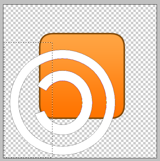
Step 6: Now select the Rectangular marquee tool and select the outer parts of the symbol and press delete to get rid of them as shown below:

Step 7: When this is done choose the Ellipse Tool and draw a small circle in the bottom left corner to finish off the icon.

Step 8: Now simply right click on the symbol layer and choose blending options and operate the Stroke and change the colour to black and the size to 3px and repeat this for the circle layer to get something similar to below:

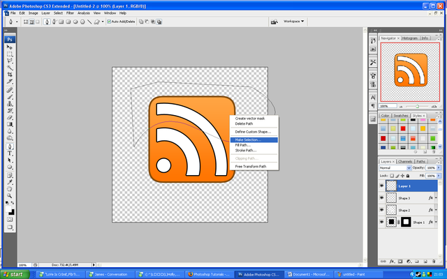
Step 9: Now create a new layer (CTRL + Shift + N) now select the pen tool and draw a curved shape across the square and right click and choose make selection as below:

Step 10: Choose the Fill Tool and fill the selection White and then choose the move tool and move to the desired position

Step 11: With the white filled selection layer still selected CTRL + Click on the layer mask of the square and then press CTRL + Shift + I, and then simply press delete to leave only the white inside the square remaining:

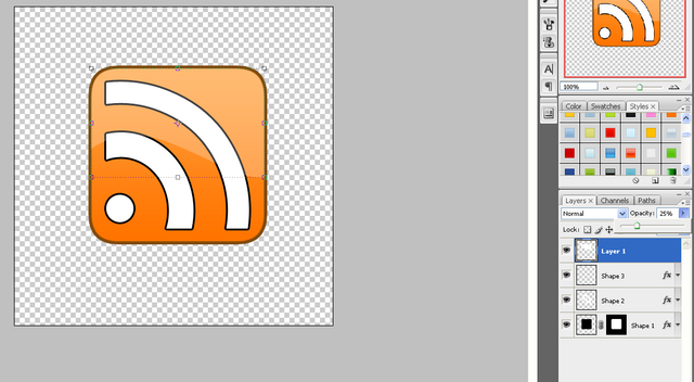
Step 12: Now change the opacity of the selected layer to 25% to give the effect of a shiny surface, and you should end up with the end product as shown:

For added effect you can refer to my Simple Reflection Tutorial and create a reflection of the Icon, and then save it as a PNG file so that when uploaded to a website it will keep its transparent background.

Final Image:

The PSD file is available to download if anybody is interested then please leave a comment asking for it or simply e-mail me at: stevie489@googlemail.com and I will happily mail it back to you

Also if you have any problems with this tutorial or need any help Photoshop then feel free to leave a comment or e-mail me.

Making a Sign/Banner Using Light and Shadow

by Steve Tolley

This tutorial has proven to be very popular as it shows how to make a sign/banner for a business or website using a variety of blending options to show light and shadow, which leaves you with a great effect at the end which would really stand out on any website/image.

Step 1: First of all create a new document sized 600 x 600, then choose the gradient tool and set the colours to: #000000, #49454d, and make sure that it is a “Radial Gradient” drag the gradient from top left to bottom right so that the lighter of the colours is in the top left.

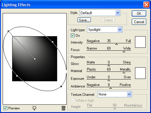
Step2: Now go to Filter > Render > Lighting Effects and use the settings as shown below, this will create the illusion that a light is shining from the top left corner,

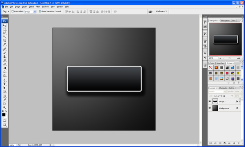
Step 3: Now choose the “Rounded Rectangle Tool” on the left hand toolbar or simply press “U” on the keyboard, and draw yourself a fairly large rectangle but make sure that the primary colour is set to black.

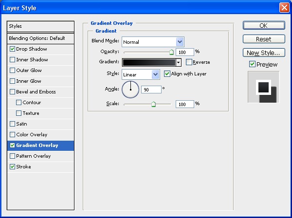
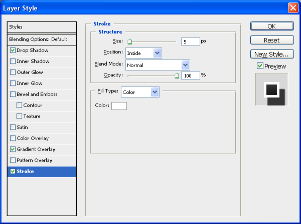
Step 4: When done right click on the layer in the layer tab and choose blending options and then choose the options and settings as shown below, when done click “OK”

Step 5: Now that you have set the blending options to the above settings you should be left with something as shown below:

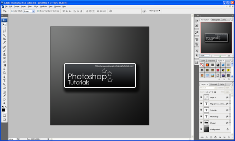
Step 6: Now we can start to add text and different effects I am going to use my own text which you can also use but feel free to use your own text and effects, after entering my text I simply added a default drop shadow in the blending options menu just to show light and shadow effects:

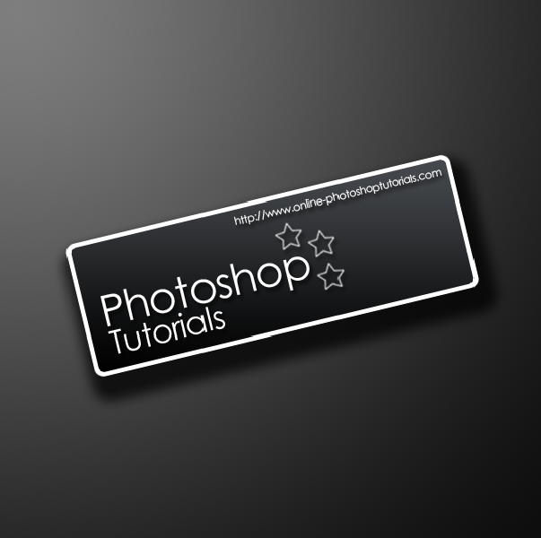
Step 7: When you are happy with what you have created then simply hold SHIFT and click the first layer and the last layer on the layers window which should select all layers (except background) and choose the Move tool and rotate to an angle that suits you best:

Step 8: To finish you can download this “Urban” Set of brushes and create a new layer above the background layer and add the one that you think looks best and set the opacity to 5% to give your design a better feel and a bit more depth

Final Image:

I also added one of the Urban brushes to the rectangle shape on a new layer below the text layers; this was to give it a better look and to show some texture instead of flat colour.

Also if you have any problems with this tutorial or need any help Photoshop then feel free to leave a comment or e-mail me.

How To Round The Corners of A Shape Using Levels

by Steve Tolley


This tutorial shows you how to simply and easily round of the corners of any shape, using layer masks and levels…

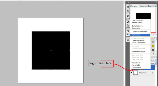
Step 1: Create a new document (the size doesn’t matter, but for this I used 500 x 500), when the document is ready make sure that you have the default colours set (although this is not essential it helps with this tutorial) and create the shape that you want to smooth the edges of (make sure that you right click and choose rasterize layer)

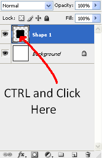
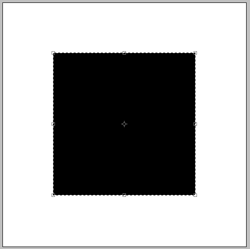
Step 2: Now hold CTRL and click on the layer in the layers tab where a preview of the layer is shown (the little box where the shape can be seen, next to the layer name) and this should select the whole of the shape, this can be seen by what look like little ants crawling around the edge:

Crawling Ants:

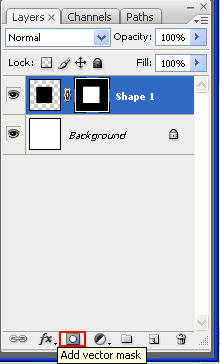
Step 3: Now go to the layers window and click the “Add Vector Mask” button as shown below:

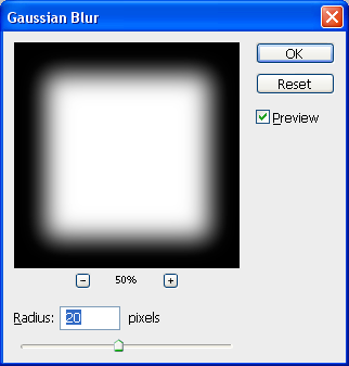
Step 4: With this layer mask selected go to Filter > Blur > Gaussian Blur and set it to a desired pixel amount (the higher the blur the bigger the curves radius, here I have used 20px)

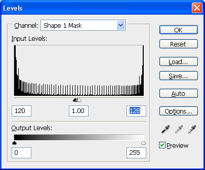
Step 5: Finally go to Image > Adjustments > Levels and play around the triangles so that you get a nice curve on the shape, try to get them all in the middle as this gives the best results, and when you are happy with the curve then press “Ok” (alternatively use the Level settings as shown below), to finish right click on the layer mask and choose “Apply Layer Mask”

Final Image:

If you have had any problems with this tutorial and would like some help then don’t hesitate to contact me either by leaving a comment below or e-mailing me at: stevie489@googlemail.com
Making Text Follow A Path

by Steve Tolley


A very simple 3 step method to make normal Text follow a drawn path, can be used in many situations with good results.

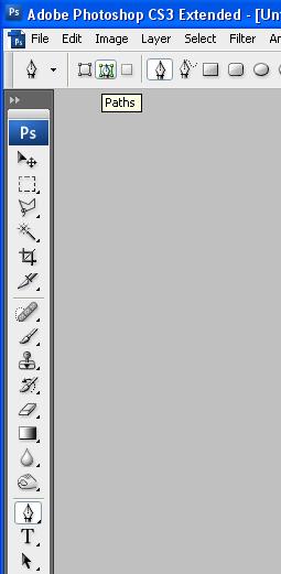
Step 1: First open up a new document (any size you want) and simply choose the pen tool and draw the desired path by clicking the start point and then clicking again where you want the line to bend (to bend click and drag in any direction to the desired size) do this until you are happy with the shape of the line.

Step 2: Now simply choose the Text tool and move the cursor to the start of your line and when the cursor looks like the one shown below click and then start typing, if done right the text should follow the line/path you have drawn.

And there you have it, Text that follows a Path:

Step 3: Now apply this method to any image to get a good effect that really stands out:

If you have had any problems with this tutorial and would like some help then don’t hesitate to contact me either by leaving a comment below or e-mailing me at: stevie489@googlemail.com
A Simple Text Reflection

by Steve Tolley

This tutorial is a simple tutorial that explains how to get a realistic looking reflection when using text or images, simple to follow and easy to understand

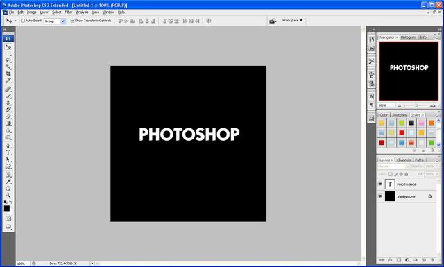
Step 1: Open up Photoshop and create a new document with the sizes set to around 500 x 500 and the background should be set to black

Step 2: Choose the text tool and write out whatever the text you want to reflect is, here I have chosen the word “Photoshop” as it is relevant to what I am doing.

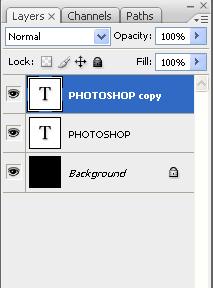
Step 3: Now press the tick on the top toolbar when you have finished typing and then press CTRL+J this then duplicates the text layer so that there are now two

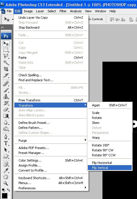
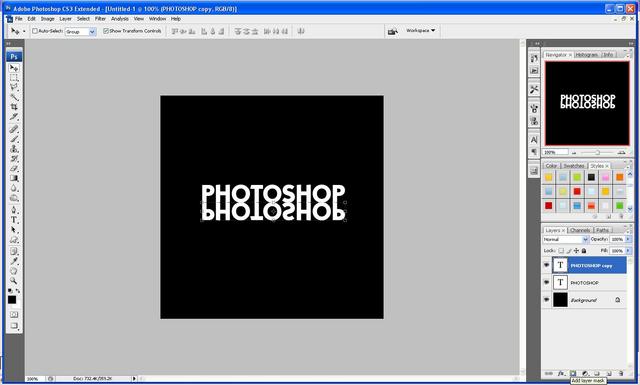
Step 4: With the duplicated layer selected go to Edit > Transform > Flip Vertical this will make the text upside down, now drag it below the original text so all the letters line up, and the press the “Add New Layer Mask” button under the layers palette as shown below:

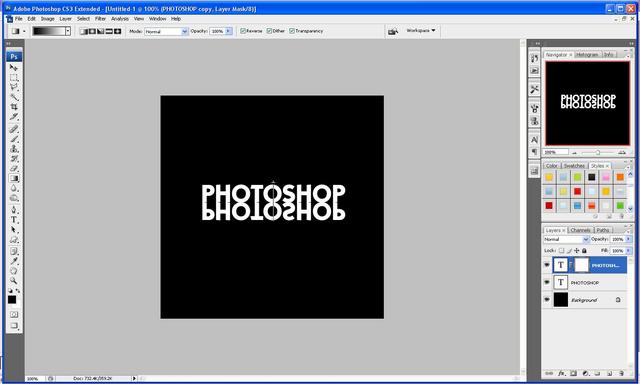
Step 5: With the layer mask selected choose the gradient tool and then click above the “O” and hold Shift and drag downwards to a desired position (the more you drag the weaker the reflection, so it is better if you don’t drag a long way down this allows you to get a more realistic looking reflection)

Step 6: After you have found the gradient that you like best you are done and should end up with something like this image below:

If you have had any problems with this tutorial and would like some help then don’t hesitate to contact me either by leaving a comment below or e-mailing me at: stevie489@googlemail.com
How To Use The Extract Filter

by Steve Tolley

This Tutorial explains how to properly use the “Extract Filter” in Photoshop

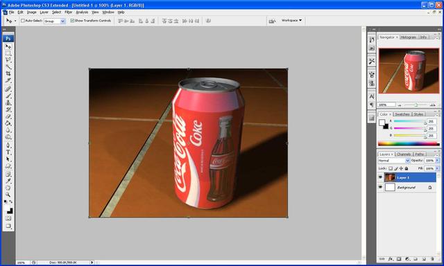
Step 1: First of all get the image that you want to extract loaded up onto Photoshop, for this tutorials I am going to extract this Coca Cola Can from it’s background and place it on a black background.

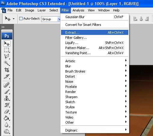
Step 2: Next go to Filter > Extract and wait for the filter to load.

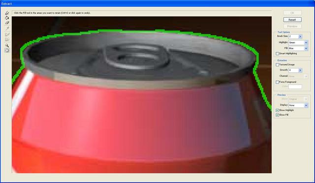
Step 3: This is where we start to extract the image first of all zoom into the image so you can clearly see the outline and set the brush size to a suitable size and then simply draw around the outline of the coke can so that there are no gaps.

Step 4: Now we can fill in the area which we want extracting to do this select the bucket/fill tool on the left hand toolbar and simply click inside of the drawn outline.

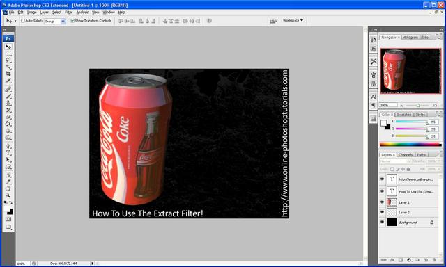
Step 5: Now press “OK” in the top right of the window and you should go back to the normal photoshop window, and if you did the last steps correctly you will have an image of a coke can without a background, if all done correct the edges will look fine, if not then you may find some discrepancies which can simply be erased.

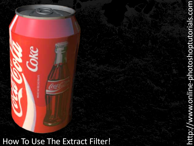
Step 6: Finally fill in the background with a black colour and add some text to give you the final image.

Final Image:

Hope this has helped, if you have any problems with this tutorial then feel free to e-mail me or leave me a comment and I will respond ASAP

Creating "Firey" Text In Photoshop

by Steve Tolley

This tutorial will show you how to create a firey text style using very simple techniques took me around 10 minutes to complete.

Step 1: First of all open up a new Photoshop document with the sizes: 600 width and 600 height as shown below:

Step 2: Next fill the background Black using the fill tool (Paint bucket)

Step 3: Now we need to add the text I am going to use the text “Photoshop” but you can use whatever text you want to.

Step 4: Now you need to duplicate the layer with the text on it (Ctrl + J) when this is done we need to hide the copied layer as we do not need it at the minute to do this click the “eye” next to the layer which will hide it for now.

Step 5: Now rasterize the original text layer to do this right click the layer and click on “rasterize type” this will change it to pixels instead of text.

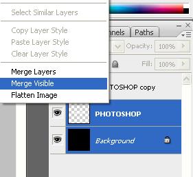
Step 6: Next select both the background layer and the original text layer and right click and press “Merge visible” as shown below:

Step 7: Now we need to rotate the canvas in order to successfully the next filter, to do this click, Image > Rotate Canvas > 90 CW and this should rotate the canvas to the right.

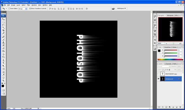
Step 8: Now we need to add the wind effect to do this click Filter > Stylize > Wind when the menu pops up choose from the left and press ok, when it applies it press Ctrl + F twice this will repeat the process twice and give you bigger flames:

Step 8: When the wind has been applied then rotate the canvas back to normal to do this simply go to Image > Rotate Canvas > 90 CWW which should rotate it back to the original way:

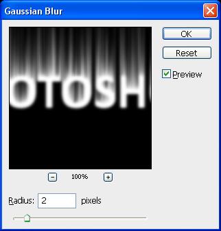
Step 9: Next we need to add a gaussian blur to do this go to Filter > Blur > Gaussian Blur and set it to blur 2 pixels which should be ideal for the amount we need:

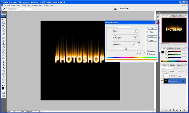
Step 10: Now go to Image > Adjustments > Hue/Saturation this will change the colour of the flames so they look firey, set it to the settings as shown below (make sure colorize is ticked) and then press ok:

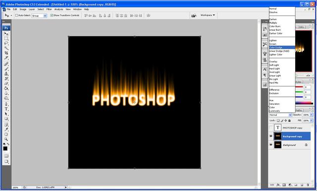
Step 11: Now duplicate this layer again by pressing Ctrl + J and then set it to Color Dodge as shown below and then right click on the new layer and click “merge down”:

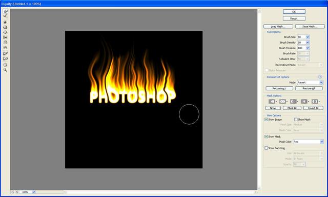
Step 12: Now with the original layer still chosen go Filter > Liquify here is where we make the flames of the fire, simply set the brush size to whatever you want and make the flames by clicking and dragging slightly left to right all the way up on each flame so that you get the result you want, this is where you can customize the size of the flames you want, as mine is shown below:

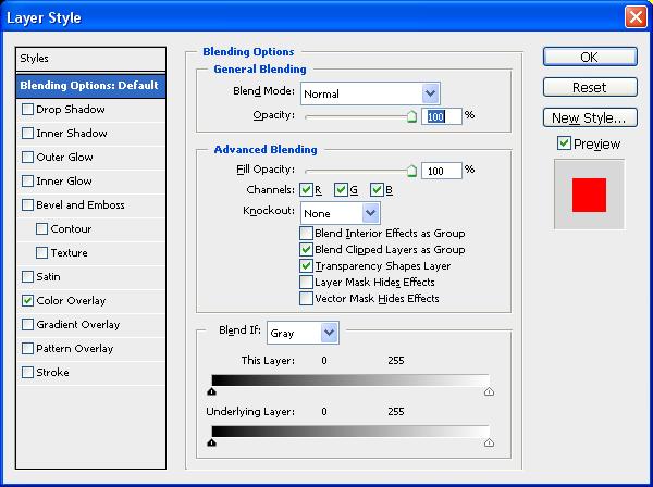
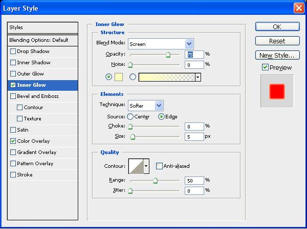
Step 13: Now unhide the copied text layer from earlier and right click and choose “blending options” this will open up a box and when this opens use the settings as shown below, when done click ok:

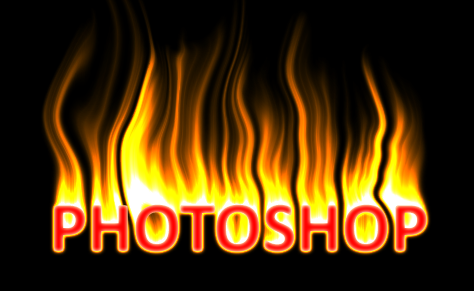
Step 14: And there you go a completed firey text effect:

If you had any problems with this tutorial then please dont hesitate to contact me by either leaving me a comment or send me an email to stevie489@googlemail.com
Creating 3D Text in Photoshop

by Steve Tolley

This tutorial is a simple but effective way to create 3D text using only Photoshop. Easy to follow tutorial with alot of detail, outcome is good and cathces the eye well!

Step 1: First of all open up a new Photoshop document with the sizes: 600 width and 600 height as shown below:

Step 2: Next fill the background Black using the fill tool (Paint bucket)

Step 3: Now we need to add the text I am going to use the text “Photoshop” but you can use whatever text you want to.

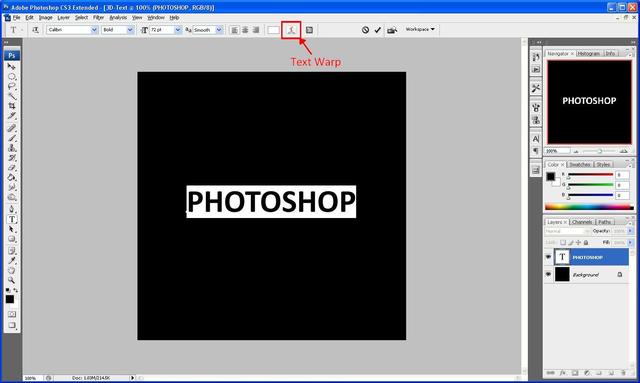
Step 4: Next we need to “Bulge” the text using the “Text Warp” tool as highlighted below:

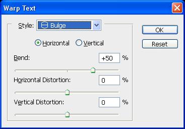
Step 5: We then select bulge from the menu that appears and use the below settings:

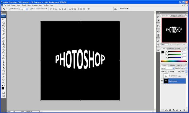
And we should get the result as shown below:

Step 6: Next we need to duplicate the text layer so that we have two layers of text, but we need to hide the copied layer because we do not need to use that at the moment (so click the “eye” next to the layer which will hide it) now we need to group the visible layers so that the original text layer and the background layer are on one layer, to do this you need to go to Layer > Merge Visible alternatively you can press “Ctrl+Shift+E” which will do the same job. So that you are left with something that looks like the image below:

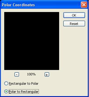
Step 7: With the Original layer (Background layer) selected go to Filter > Distort > Polar Coordinates and use the settings below:

Then click OK which will give you something that looks like the below image:

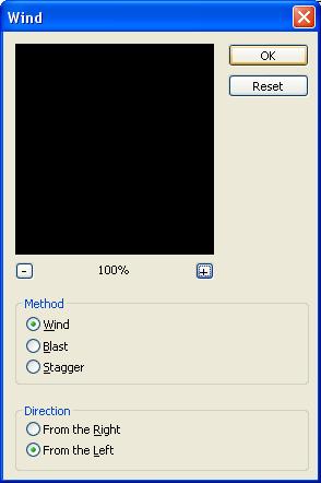
Step 8: Now go to Image > Rotate Canvas > 90 CW this will then rotate the canvas, then you need to go to Filter > Stylize > Wind and use the settings as shown in the below image:

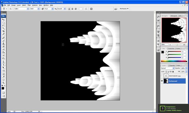
After you press ok press Ctrl+F ten times which will repeat the wind filter ten times to give you something which looks like this:

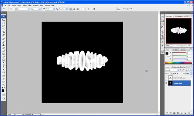
Step 9: Now you need to rotate the canvas back to how it was before so go to Image > Rotate Canvas > 90 CCW which will give make the canvas rotate to its original position and now we need to reverse the Polar Coordinates so that it is how it was, so go to Filter > Distort > Polar Coordinates and choose Rectangular To Polar which will reverse the one that you did before, and you should end up with something like the below image (if not then check back to make sure that you have done everything ok up to now)

Step 10: Now comes the stage where we need to unhide the copied text layer so click where the eye was and it should reappear (but if you did the text in white you won’t be able to see it, so just change the colour of the text by highlighting it and changing the colour) and you should now see it like below:

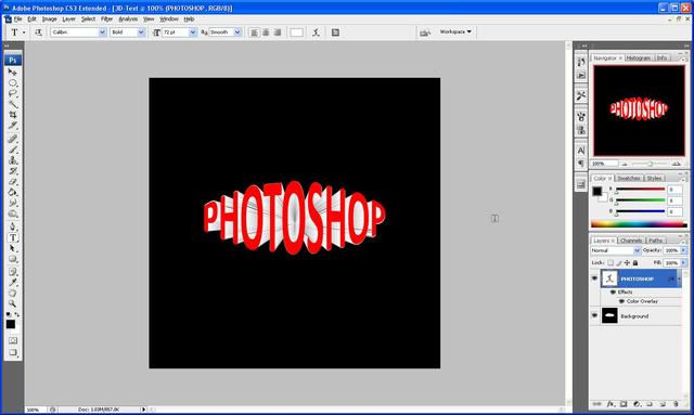
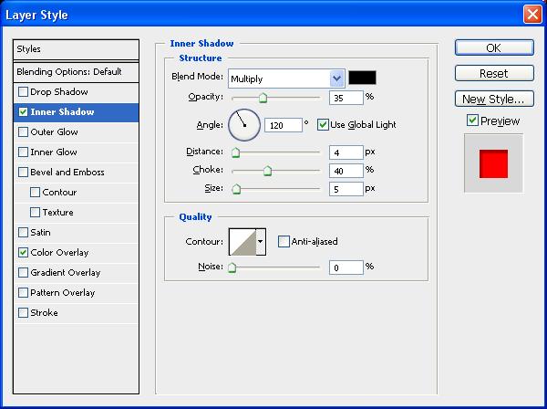
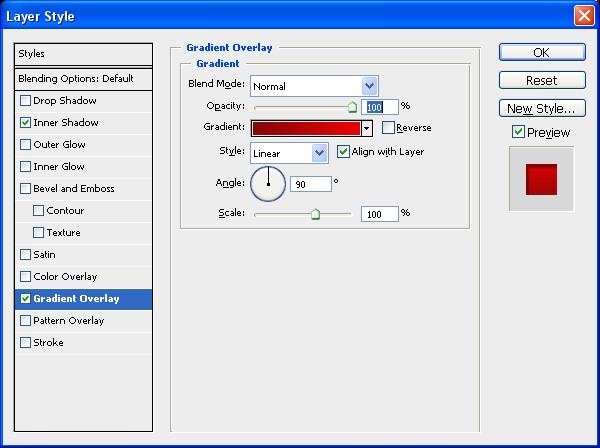
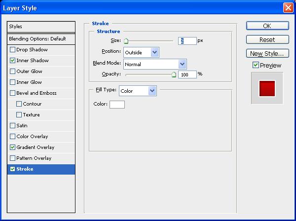
Step 11: Now all we need to do to finish is add a few “Blending Options” to access them either double click on the layer itself or go to Layer > Layer Style > Blending Options once the window opens up use the below setting as shown and you should get the final outcome (I chose red but you can use any colour that you want to)

If you do all of this correctly then you should get something that looks like the image below:

Thank you for reading and I hope that this tutorial has helped you, if you have any problems with this then don’t hesitate to contact me, either leave a comment or send me an email to stevie489@googlemail.com and I will respond ASAP.