Making A Modern Looking Navigation Button
This tutorial will teach you some fundamental techniques when it comes to making cool looking buttons for a navigation bar easy to understand with plenty of detail and a nice looking outcome that can be used on any modern looking website.
Step 1: First of all open up a new document any size that you want (I used sizes 500 x 500)
Step 2: Now choose the gradient tool and set the gradient to radial gradient as shown below, and set the colours to: #000000, #49454d and drag from the middle outwards so that the lighter colour is in the middle.

Step 3: Now choose the rectangle tool and draw quite a large rectangle in the centre of the document, we now need to curve the edges, to do this simply follow this tutorial on “How To Round The Corners of A Shape Using Levels” after this you should be left with something like below:
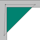
Step 4: Now we need to draw a small rectangle and place it in the top right hand corner of the rectangle this will make that corner square again which gives the button a more modern cool look, when done press CTRL + J (Duplicate) with the small rectangle selected and move the duplicate layer to the bottom left hand corner to create the same effect so that you are left with something similar to below:
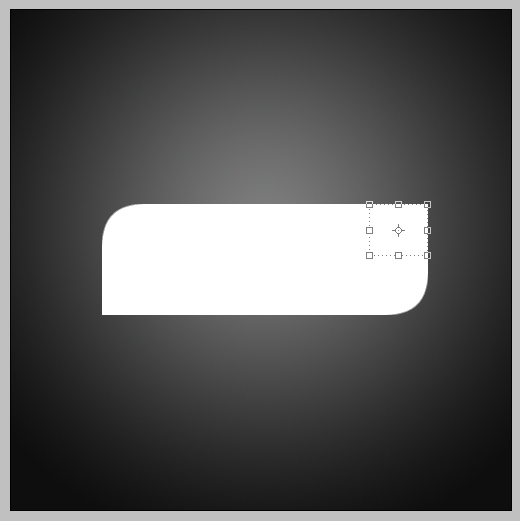
Step 5: Now right click on the separate layers that you have and choose “Rasterize Layer” this will convert the shapes to pixels, when done select all 3 of your rectangles and right click on one of them and choose “Merge Layers” this will merge them all into one layer:
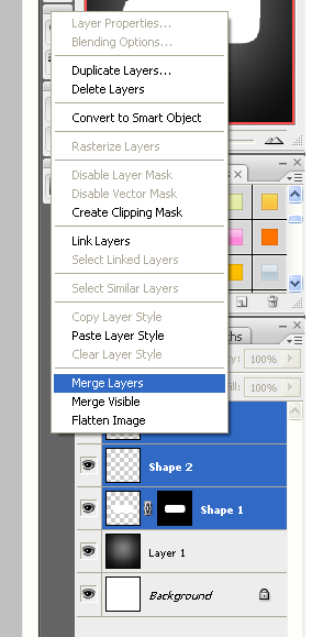
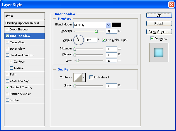
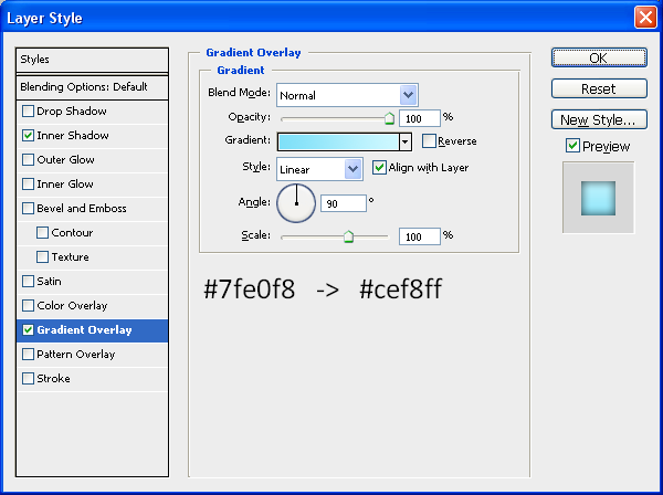
Step 6: Next you need to double click on the rectangle layer which will bring up the “Blending Options” window, with this open you need to use the settings as shown below to get the same effect as me (you can also use your own colours):
Inner Shadow:
Gradient Overlay:
After adding these effects you should get a result similar to below:
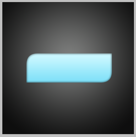
Step 6: Now add the text that you want to use, I am using “Home” as it is for a Navigation Bar and place it in the centre of the button,
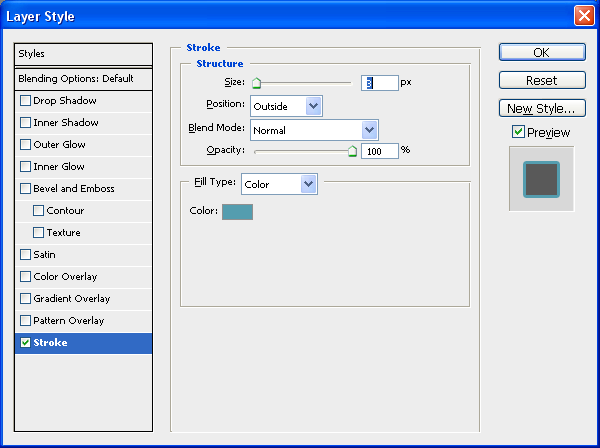
Step 7: To finish double click on the Text layer to open up the “Blending Options” and choose stroke and set it to the settings as below, alternatively to get the right colour you simply need to make the stroke a darker version of the colour used on the button:
Stroke:
Finished Button:
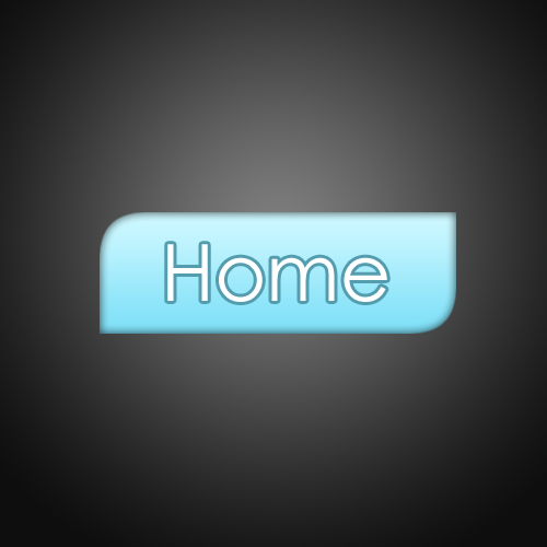
For added effect I have added a reflection on this one using THIS tutorial and created a couple more buttons in different colours so you can see what they could look like:

The PSD file is available to download if anybody is interested then please leave a comment asking for it or simply e-mail me at: stevie489@googlemail.com and I will happily mail it back to you
Also if you have any problems with this tutorial or need any help Photoshop then feel free to leave a comment or e-mail me.


Hey id like the psd file please
I would like to have it too. thanks
thk you verry
Can i have the psd please?
nite tutorial guys, i will use this asap i finish all 5 buttons, thanks a lot for sharing
Thank u for this tutorial
I need the psd file too!
Very nice
I would like to have it too. thanks
Great design and shadow. Well defined tutorial. Thanks for sharing this nice tutorial.
I would like to get the PSD file please.
great tutorial.
very good
can u send me the psd?
Pls, send me the psd file.thanks
can I have the psd file
i would the psd plz
very nice work…
could I please get the psd from you
thank you.
I would like the file please.
Thanks a lot for the tutorial, it really helped me ^_^
Hi, Nice tutorial
Could you please send me the psd file of this.
can you send the psd to me?
i would like to get de psd
Would love the .psd for these!
Perfect for my current project. Thanks.
if u do not mind please forward the psd i liked it
please continue posting u r tutorial
i would like the psd for these also please.
I like your tutorial very much, so does the button you design.
Could you please send me the psd file? Thanks!
Hi There! Nice Tutorial, I wonder, is the psd file still available?
Thanks!