Creating A Retro Grunge Poster
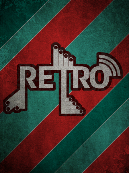
This tutorial is an add on from the Poster article the other day, we will create a Retro/Grunge style poster using the pen tool some textures and playing with text to make it look more retro,
What We Are Going To Achieve
Step 1 - Create A New Document
First of all as always create a new document using the sizes 750 x 1000, this size is suitable for a poster design.
Step 2 - Grab The Pen Tool
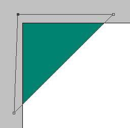
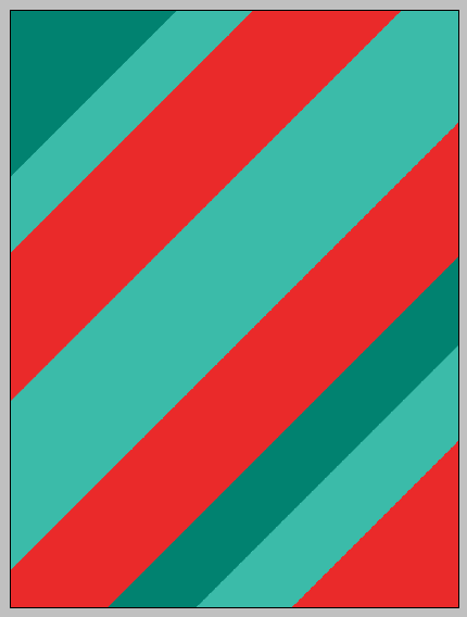
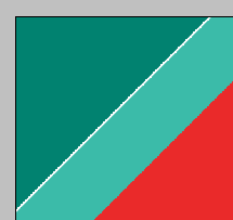
Now you need to grab the pen tool and start drawing some shapes, first set your foreground colour to #018270 and draw a shape the same as below to get perfect 45 degree angles when drawing with the pen tool hold down shift and click at what you think is 45 degrees and it will make it straight:
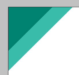
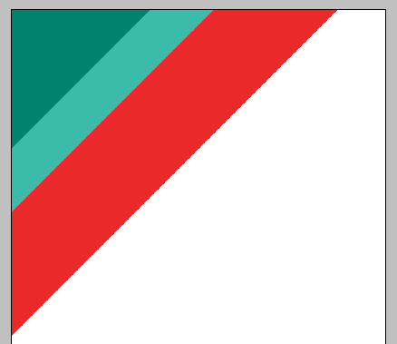
Now continue with this same method, but when drawing the rectangles make sure the shapes differ in size to add some variation within the poster, Use the colours as shown below:
#3bbba9
#ea2a2a
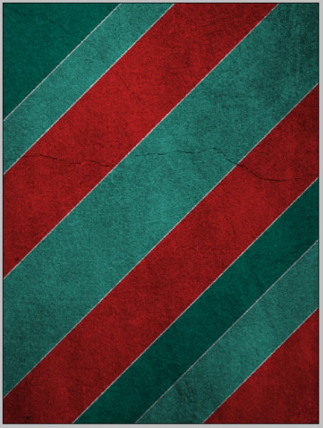
Now continue mixing and matching with these colours until you have something similar to below:
Step 3 - Blending Options
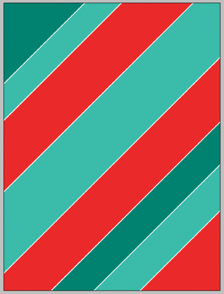
Now we are going to add a simple Stroke to each of these shapes to do this, double click on the first shape to bring up the blending options menu, from here select the stroke at the bottom and make sure the colour is set to white (#FFFFFF) and leave the size at 3px:
Now we need to repeat this throughout all of the shapes to do this right click the first shape in the layers tab and choose the option Copy Layer Style and then right click each of the other shapes and choose Paste Layer style, this will simply copy and paste the stroke to all of the shapes this will leave you with something similar to below:
Step 4 - Adding A Background Texture
Now we are going to add a background texture to the shapes to do this grab hold of THIS texture and copy and paste it into your current document and resize and position so that you are happy with it, when you are happy press CTRL + SHIFT + U to desaturate the layer, you now should be left with something like below:
When you have the same as above all you need to do then is set the layers style to Multiply:
When this is done then the background texture is complete and you should have something that looks the same as below, notice the grungy sort of look to the background:
Step 5 - Adding The Text
Now we need to add the text to the document, I have added the text “RETRO” all in capital letters this is so that it corresponds with the effect we are going for, the text I have used is called ADFBEasterEgg which can be found HERE when you have the text added to the centre of the document you should have something like this:
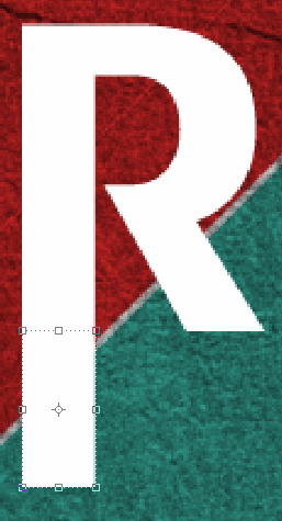
Now we are going to modify the text by making the letter T and the first letter R longer, to do this grab the rectangular marquee tool and make a selection the same as below:
Now make sure that the Text layer is selected in the layers tab and then pick the move tool and press CTRL + C to copy the selection and then create a new layer (CTRL + SHIFT + N) and then simply paste the selection by pressing CTRL + V and position the layer underneath the selection made as shown below:
Now you can resize the selection as you see fit, I have lengthened it to the length shown below, I have also applied the same method to the letter T, when these are done you will have the same as below:
Step 6 - Adding Brushes
This step is simple as all you need to do is to download THESE Retro brushes and also THESE brushes and simply play around with the different options/brushes that are available, for a guide on installing brushes simply go to THIS tutorial on Tutorial9.net once these brushes have been downloaded and installed then play around and use the below image as a reference to what brushes to add where:
Step 7 - Adding A Background To Text
We are going to add a background to the text, to do this we need to group all of the layers that make up the text so select the layers by CTRL + Clicking them individually in the layers tab and the right click and choose Merge Layers (Note: You may need to rasterize the text layer so simply right click and choose rasterize layer this will convert it to pixels)
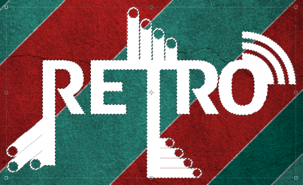
When you have all of the layers that make up the text into one layer CTRL + Click the box next to the layer in the layers tab which will select all of the outside and you should see the crawling ants like below:
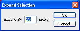
With this selection made go to Select > Modify > Expand and use the settings shown below:
When this expand has been applied you will have a selection as below:
When you have this selection create a new layer (CTRL + SHIFT + N) and then pick the Fill Tool and fill the selection with the colour #4c2222 you will then have the below:
Step 8 - Adding A Texture To The Text Background
To finish we are going to add a texture/pattern to the background we have just created for the text, to do this grab hold of THIS pattern and copy and paste it into your poster and position it over you background (Note: Place the pattern layer below the text layer BUT above the background text layer so it gets applied to the background only)
Now right click the pattern layer in the layers tab and choose Create Clipping Mask and then to finish set the layer style to Color Burn this will then get rid of the white from the image and darken the remaining colour, now place the grunge texture above all of your other layers so that it is applied to all the layers this will then leave you with the finished poster:
And as always if you have any problems with this tutorial then don’t hesitate to leave me a comment or email me at: stevie489@googlemail.com and I will help you as much as I can…
If you have taken the time to have a go at this tutorial then upload your finished images to the Photoshop Tutorials Flickr Group so others can see what you have achieved using these methods.










Kurt is rolling…
That was actually pretty good, nice work!
You could have done the “Expand Selection” with an “add border” (Blending options), but this’ll work too .
.
Keep it up!
@Wolf…. ?
@Marco, Thanks for the feedback and the tip, there are many different ways to do the same method, you could of even used the pen tool if you was bored enough lol
Great tutorial, looks good! Thanks to Marco for the tip too.
wow, thanks. this turned out great. i suck with the pen tool, so my lines didnt come out that great, but i still love it. check out mine. http://i35.tinypic.com/of09wl.jpg
@WilliexWhip Very nice mate, the lines seem fine maybe not perfect angles, just remember to hold Shift when drawing them to get perfect straight lines and 45 Degree angles, Your end result looks great maybe you can upload it to the Photoshop Flickr group shown in the sidebar so others can see it to
nice tutorial.it looks really great.keep up the good work in here
Ronald
Sweet! I can use this one. Thanks.
Very cool! thanks!
Thank you. One of the best and easiest tutorials to follow. I really appreciate it!
Really nice tutorial
Thankss….
Nice choice of colors mate. Love the tutorial.
Cheers
Simon
I love this effect you explained it really well cheers
Nice tutorial! Thanks for sharing…
DAMN … I LOVED IT !!!!!!! great work thank uuuuu ….
Here is my weak attempt at the tutorial… Hope it’s at least someone was pleasing…
http://img139.imageshack.us/img139/1165/retrotagjf2.png
@Mars It looks great mate, well done
Nice tut
But I dit a bit more with it.
Here is my outcome:
http://i35.tinypic.com/b4uekm.png
This is gorgeous. Will post it on my site soon. Thanks so much
Thank you very much.
Cool! I need a background like that for a project I’m working on right now.
Thanks!
EXCELENTE LOKO TERIBLE BKN
Great tutorial! Thanks so much!
Great Tutorial…..and definately one of the simplest I have come across. Thank you.
One of the best tutorial!
Heya I really liked this tutorial I Actually used it for my website for a few days with the stripes as the background and the gray concrete as the center it turned out really nice, but then I upgraded to phpfox. I was using elgg. Here is my current version if you want to see Ravesquare.com.
VERY NICE TUTORIAL TAHNK YOU SO MUCH !!
Hello.
On step 7 i don’t get that rectangle around my text. I get crawling ants around the letters, but i don’t get that rectangle around the whole thing.
I tried anyway, but then the letters were filled with colour, not the part around the letters. Hope you understand me, and can tell me what to do.
Annie
What a great bit of photo retouching work. Thanks and please post more like this.
podria especificar como realizar los pasos 2 y 3 ?
thanks a lot men….
its easy to follow and ILOVE RETRO so much
very nice tutorial indeed
Thanks alot. here’s mine. i added some extra grunge brushes. it looks really good
http://www.filedropper.com/musicgrunge
That looks really cool, nice use of the extra grunge brushes, really gives it a nice effect, keep it up
Hi,
Nice tutorial, I made the 10 retro brushes used in the tutorial! Just came across an image and recognised them.
Thanks for making use of them in such a great way.
No problem, keep up the good work!
Thankyou for making some great brushes for me to use in the tutorial, they really give the image that retro feeling
one of the best and well explained text-tut ever! thank you very much!!
beautiful work and really nice and simple work flow
thanks for sharing
Great tutorial! Here’s my result, wanted a new background for my work laptop: http://i25.tinypic.com/x1d5cn.jpg
Thank’s a lot for the tutorial!!
your tutorial is really something. thanks for providing source files.
I loved your tutorial . I uploaded my outcome on dA: http://dandelioncorona.deviantart.com/art/Retro-poster-practice-138848619
It’s my first attempt at this type of design. I credited your tutorial, of course. Thank you so much! ))
))
Thank you sooo much for this amazing tut.
just awesome!
This is my final product:
http://i36.tinypic.com/4iik8z.png
It is nowhere near as good as anyone else’s but I guess trying to use patterns that don’t tile properly on a screen with 1280 x 800 res can’t help! Oh well. Brilliant tutorial!
rocking man
i am having a problem doing this. on the 8th step i cant seem to make the texture after i chose the color burn, it just turns back to white. help please?
beautiful retro style Poster, amazing techniques you sharing. thanks
Tnx, for tutorial…
very cool and beautiful outcome
I was wondering instead of retro can you make one that says padnas? Thank you if you can.
Really amazing tutorial thanks for sharing !