Paint Splodge Text
This is just a quick text effect tutorial, This will show you how to simply create a paint splodge looking text using blending options and the pen tool it will take only around 5 minutes to complete (Depends how much detail you add).
What We Are Going To Achieve
Step 1 - New Document
First of all open up a new document around the size 500 x 500 and fill with a radial gradient from #102f40 to black (#000000) so you are left with something like below:
Step 2 - Add The Text
For this tutorial I am just doing a single letter so I can show you the techniques, but this can be applied to any letter of the alphabet, therefore I am going to use the letter “P” so simply pick the colour that you want the paint to be and write your text in that colour:
Step 3 - Add The Splodge
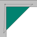
Now you can draw the paint splodge simply pick up the pen tool and draw what resembles a splodge of paint, not every splodge will look the same so just experiment and play around until you get something you are happy with (make sure it is filled with the same colour as the letter), when done you should have something similar to below (can be used as a reference)
Step 4 - Add Blending Options To Both
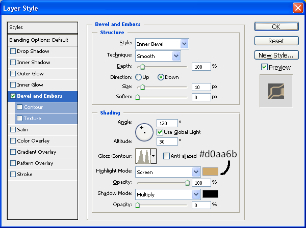
We shall add blending options to the text first so double click the layer in the layers tab which will bring up the blending options menu, when this is open use the settings as shown below:
Bevel And Emboss:
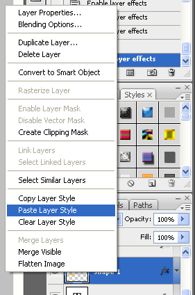
With this applied right click on the Text layer and choose “Copy Layer Style” and then right click on the Splodge layer and choose “Paste Layer Style” as shown below:
This will simply copy and paste the blending options to the splodge shape when this is done you will have some text and a splodge that resembles that shown below:
Step 5 - Positioning And Adding Details
Now you need to position the splodge so that it looks like it is part of the text so just simply play around with moving it around until you get something you are happy with:
With it now in position you are nearly finished all you need to do now is add some detail, like some drips of paint and extra splodges on the floor, this is all simple to do but just play around with the pen tool creating cool shapes and then don’t forget to keep pasting the blending options onto each new splodge you do, and have fun experimenting, when you are done you will have something that resembles my finished product:
And as always if you have any problems with this tutorial then don’t hesitate to leave me a comment or email me at: stevie489@googlemail.com and I will help you as much as I can…









Smart work!!
really nice effort for share photoshop techniques. thanks
Instead on having to use the pen tool with all the splatters and drips, I found it alot easier to use the brush tool after you set up the paint texture.. The brush will drag out parts of the letter itself yet still retain the paint shimmer.. you can also use the brush in the same way to create the puddle.
@Connor Brilliant, there are different ways to create the same sort of effect, it’s about experimenting to see which way gets the results you want, thanks for the comment
Wow… Awesome tutorial. I really liked how the final outcome looks. It serves as an inspiration for my logo actually - paint splatters in various colors and with a gradient effect. I tried using this concept on my logo but it somehow looked a little bit “off”. Haha. I can’t get it to look as good as yours. Gave up after trying for days. Finally decided to use the professional services of an online logo design site instead after googling for one (http://www.logodesignplanet.com) and finally got the logo I wanted at an affordable price and fast too. I did show the designer the link to your site to explain how I wanted the logo to like. Lesson learned. I’m not going to design a logo without any professional help although it’s somewhat fun. Anyway, thanks for the cool tutorial…
This look great. Hope you will share more tutorials. Can I ask how you can create images like that of sexybookmark plugin.
Great guide that could fit into many logos etc by changing a few options….
Great work
Awesome tutorial, but I got in to a problem. My splodge doesn’t blend in with the letter, why?
Great tutorial