The ‘Colour’ Wallpaper Tutorial
This tutorial is an addition to the previous wallpaper tutorial I did, as that got such a good response I thought I would make another wallpaper this time using different methods to achieve quite a unique look.
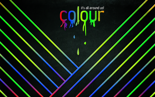
What We Are Going To Achieve
Step 1 - New Document
With this being a wallpaper tutorial you will need to make the canvas size the resolution of your screen, so therefore I am using the size 1440 x 900 but make sure you match it to your screen size and just go ahead and create a new document with these sizes.
Step 2 - Gradient Background
Now you need to fill in the background with a Radial Gradient, so pick the gradient tool off the sidebar and make sure that radial gradient is selected:
Now select the colours and set them to #243430 -> #000000 so that the greeney colour is on the left hand handle in the colour selection menu.
Step 3 - Texturing Background
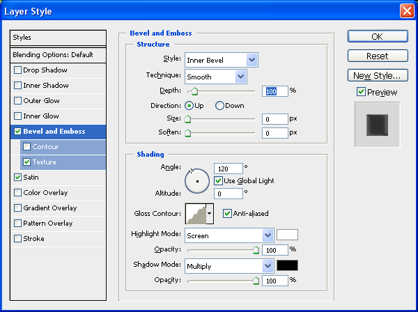
Now that we have the colour set we are going to add a slight texture to the background to make it stand out some more, so double click the Background layer in the layers tab which will then make it an editable layer, when this is done again double click the now called ‘Layer 0′ in the layers tab to bring up the blending options and use the settings below:
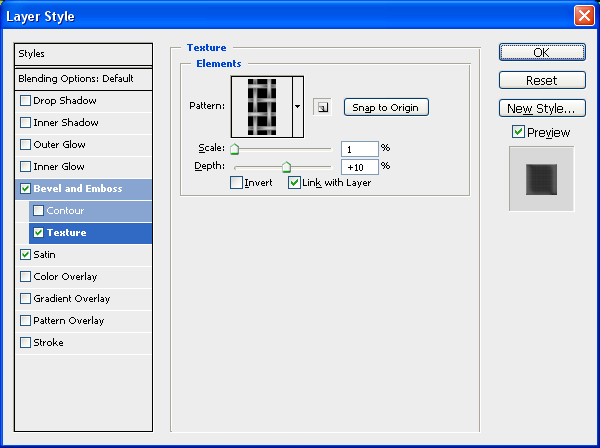
To get the below texture click the little arrow next to the preview and load the “Patterns” set of textures and choose the one shown below:
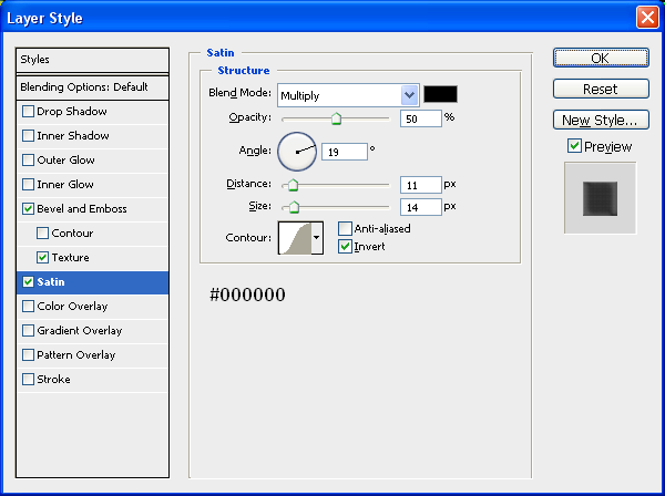
And finally add a satin effect to the background to darken it abit:
After applying all of these settings above you should now be left with something similar to below:
Click To Enlarge:
As you can see the texture really gives some depth and life to the image!
Step 4 - Adding The First Line
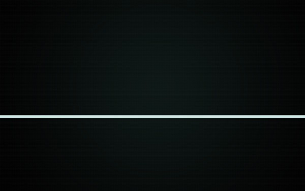
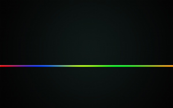
The main part of this image are the multiple lines that go diagonally across the image, this is simply one line with some blending options added which has then been repeated and manipulated to bring the sense of ‘colour’ to the image, to make this line we need to grab the rectangular marquee tool and draw a rectangle from one side of the image to the other:
Now we need to style it by adding the blending options:
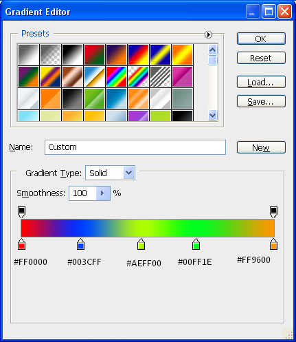
Gradient:
For the gradient try to match the colours as best you can, or you can use your own set of colours to match your style:
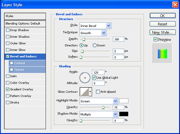
Bevel And Emboss:
And now a simple bevel and emboss, but we are going to remove the shadow from the option by taking the opacity down to 0% this is so that we get a nice highlight at the top:
Also add a simple drop shadow with all of the default settings to give some depth to the line
With these three blending options applied you will have a line across your image that looks like this:
Step 5 - Multiplying The Line Across The Page
The best thing to do here would be to press CTRL + J to duplicate the layer and then hide the original one by pressing the eye in the layers tab next to the original line layer, this is so that you have one there you can come back to if you mess up further on.
With the duplicated line you need to rotate it to a 45 Degree angle, to do this press CTRL + T to enter Free Transform mode and hold down shift whilst rotating the layer until it is at a 45 Degree angle, with this done place in the bottom right hand corner as shown below:
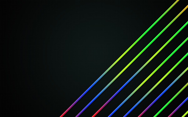
Now all there is to do, is duplicate the layer (CTRL + J) and reposition it above the one before it, and repeat this process until you have something similar to the image below:
TIP: Move the lines around a bit so that you get a different array of the colours rather than the same colour all the way through.
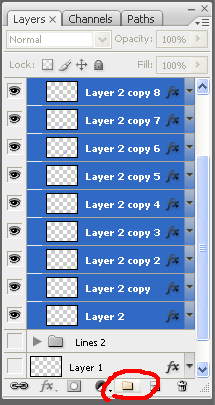
To create the lines on the other side of the image simply group together all of the previous lines layers and put them in a group:
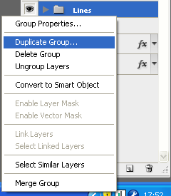
When the layers are in a group, the little folder icon appears with your group name, right click on this group and choose “Duplicate Group” which will make an exact copy of the group and call it something relevant e.g. “Lines Left”
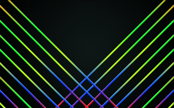
Now with the duplicated group selected in the layers tab go Edit > Transform > Flip Horizontal which will flip all of the layers inside that group over, now choose the move tool and move to the left hand side of the screen and position in reference to below:
So they want to look like a mirror image of each other basically
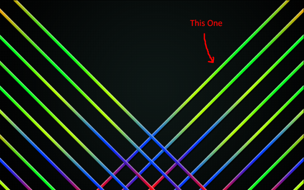
Next we need to cut off the bottom of the lines, to do this we need to highlight the top line on the right set (shown below) when we have this layer selected in the layer tab CTRL + CLICK in the box next to the layer name to get the crawling ants around it:
With the crawling ants around the line press CTRL + SHIFT + I to invert your selection, and the from the sidebar menu grab the magic want tool (making sure you still have the line selected in the layer tab) and then ALT + CLICK anywhere in the top left section of the image, this deselects this part and should leave the bottom right part of the image the only bits with crawling ants around.
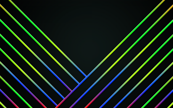
With the bottom right selected select the group of the lines on the left and go through each of them pressing Delete to delete the part of the lines that are crossing over and you SHOULD be left with something similar to below:
(Note: The group of lines on the left need to be placed under the group of lines on the right in the layers tab so that they don’t appear on the top of the lines on the right)
That is the lines finished with although you can mix and match the colours if you wanted to
Step 6 - The Text
This part involves writing out the text and adding the drips to it which is basically drawing drip like shapes below the text using the pen tool,
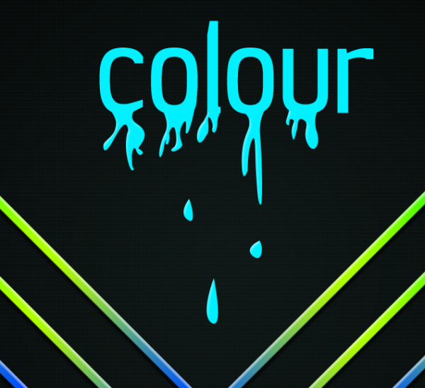
I chose the word “Colour” because I think it is what best describes this wallpaper so I proceeded to grab the text tool from the side toolbar and wrote the text in the middle at the top of the image, I used the font Jesaya for my text and then wrote the word colour, all in lowercase
(Note: As I am english I am spelling it the english way but you can spell it however you want to)
Now you should have something like below, note also that it doesn’t matter about the colour of the text at the minute as we will be adding a gradient to it later:
Now grab the pen tool and draw a drip like shape coming from the bottom of the letter “C”
(Note: Not all drips will be the same so play around and experiment with your own shapes and drips)
With this done I had something similar to below:
Now proceed to do the same with the other letters and remember to be creative with your drips and you can even miss letters out if you wanted it’s entirely up to you, when you are done playing you will have something similar to what is shown below:
(Note: I also added some drips below the text to give the effect that it was falling off the text drips above)
Now select the text layer and all of the drip layers and right click and choose “Rasterize Layers” this will make them all into pixels (if they are not already) now right click again and choose “Merge Layers” this will make them all one layer.
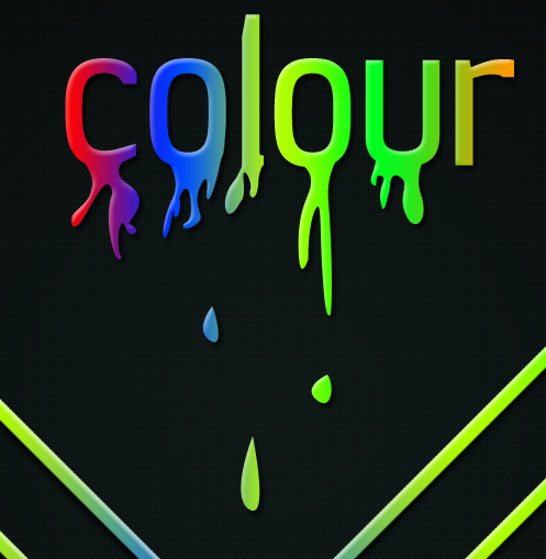
To add the same effects to the text as you have on the lines then find the original line that you made in the layers tab and right click and choose “Copy Layer Style” and then go back to the now merged text layer and right click and choose “Paste Layer Style”
With this done you will have something similar to below:
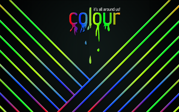
Now simply add a nice, relevant motto to the top right hand side of the text, I chose “It’s All Around Us” as the motto as I believe that it best describes colour at the minute as everywhere you look there is always some colour that stands out at you.
With all of the above steps completed you will have an image like the one shown below, and now only one more step to go and then we are done:
Step 7 - Adding An Overlaying Texture
To finish we are going to add a texture over the top of all of the layers so that it gives it some more depth and brings it more to life, the texture we are going to use is located HERE you may recognise this layer from a previous tutorial that I did on a retro grunge poster that has turned out to be very popular, with this in mind I thought I would use it in this tutorial, as also I think this particular texture definitely adds alot of depth to the image.
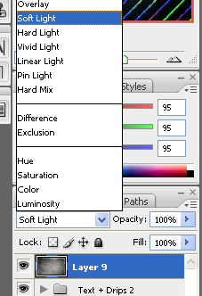
So once you have grabbed hold of the texture then open it up in Photoshop and drag and drop it into the wallpaper canvas, and resize and rotate if necessary so that you are happy with it and then with it selected change the layer style to “Soft Light”
With this done you should be left with the finished wallpaper as shown below:
It would be cool to see what you come up with so feel free to upload them to the Photoshop Tutorials Flickr Group and leave me a comment to say when you have uploaded one so people can comment on them,
And as always if you have any problems with this tutorial then don’t hesitate to leave me a comment or email me at: stevie489@googlemail.com and I will help you as much as I can…







Very good! I really enjoy background You chose!
Great tutorial
thanks for the tutorial! I suck with pen-tool, so my result is a bit different from yours’ but hey, nothing wrong with a bit of artistic freedom eh? ^^
http://www.klenodium.com/klenodium-desktop-1024×600.jpg
Elo Scram
Sweet site you got goining here…this I will defvently check out more times
Btw why not use like “Liqufi” or what’s it called?
But any way, cool tut
Peace Out
Vidstig
I don’t understand what doing with my PS
Your made :
http://www.online-photoshoptutorials.com/wp-content/uploads/2008/10/left-lines-position.png
And my made
http://u.stats.lt/i/20090124135426/my.jpeg
Nice.
I like to spell my color without a “u”. Unlike all the stupid brits.
The .zip-file which contains the .psd-file is corrupted!!! please make a new upload of this file! I couldn’t find your grunge texture on deviant art! please upload it again!!!
Fantastic Tutorial, I could do wih some more like this.
verygood tutoriol
I’d like this tut! Thank’s