Defining The Photoshop File Types

by Steve Tolley

This post is going to give the definitions for each file type that you can save as in Photoshop CS3 (as this is the one I use) Most of the below file types you won’t need but I thought it would be useful for you all to know and understand what each of them are for just in case.

Lets start with the most used file type:

Photoshop File (*.PSD*.PDD)

What is it?
Photoshop format (PSD) is the default file format and the only format, besides the Large Document Format (PSB), that supports most Photoshop features. Because of the tight integration between Adobe products, other Adobe applications, such as Adobe Illustrator, Adobe InDesign, Adobe Premiere, Adobe After Effects, and Adobe GoLive, can directly import PSD files and preserve many Photoshop features.

The .PDD (PhotoDeluxe Document) format is a version of .PSD that only supports the features found in the discontinued PhotoDeluxe software.

BMP (*.BMP*.RLE*.DIB)

What is it?
The BMP file format, sometimes called bitmap or DIB file format (for device-independent bitmap), is an image file format used to store bitmap digital images, especially on Microsoft Windows and OS/2 operating systems. Many graphical user interfaces use bitmaps in their built-in graphics subsystems.

File Size/Compression?
While most BMP files have a relatively large file size due to lack of any compression, many BMP files can be considerably compressed with lossless data compression algorithms such as ZIP (up to 0.1% of original size) because they contain redundant data.

CompuServe GIF (*.GIF) - Lossless

I found this awesome GIF image that represents this file type perfectly:
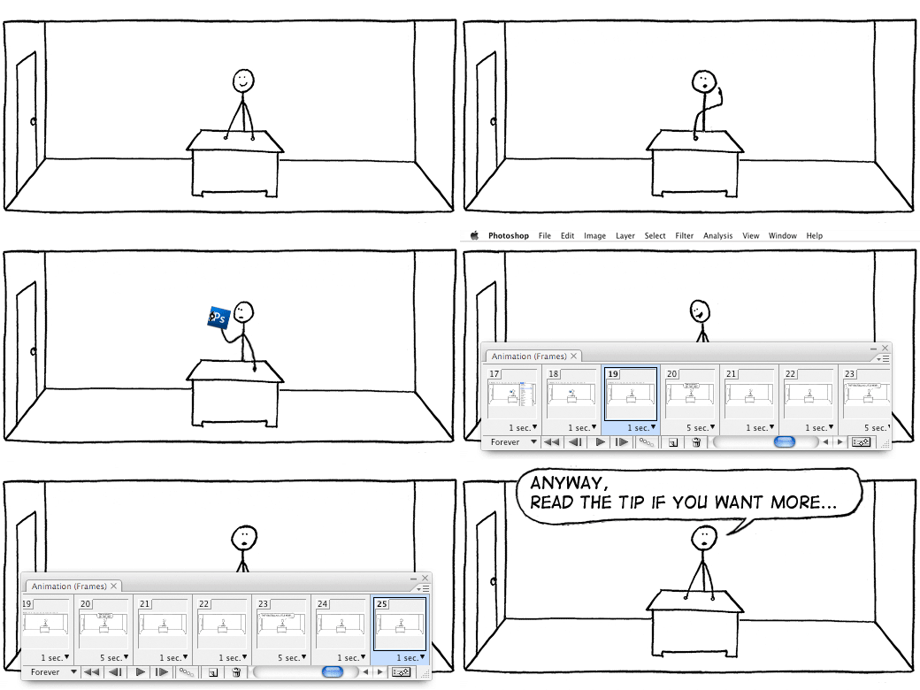
stickmananimation

What is it?
The Graphics Interchange Format (GIF) is a bitmap image format that was introduced by CompuServe in 1987 and has since come into widespread usage on the World Wide Web due to its wide support and portability.

The format supports up to 8 bits per pixel, allowing a single image to reference a palette of up to 256 distinct colors chosen from the 24-bit RGB color space. It also supports animations and allows a separate palette of 256 colors for each frame. The color limitation makes the GIF format unsuitable for reproducing color photographs and other images with continuous color, but it is well-suited for simpler images such as graphics or logos with solid areas of color.

File Size/Compression?
GIF images are compressed using the Lempel-Ziv-Welch (LZW) lossless data compression technique to reduce the file size without degrading the visual quality.

Dicom (*.DCM*.DC3*.DIC)

What is it?
Digital Imaging and Communications in Medicine (DICOM) is the most common standard for receiving medical scans. Photoshop Extended allows you to open and work with DICOM (.DC3, .DCM .DIC, or no extension) files. DICOM files can contain multiple “slices” or frames, which represent different layers of a scan.
Photoshop reads all frames from a DICOM file and converts them to Photoshop layers. Photoshop can read 8 , 10 , 12 , or 16 bit DICOM files. (Photoshop converts 10 and 12 bit files to 16 bit files.)

Photoshop EPS (*.EPS)

What is it?
Encapsulated PostScript (EPS) language file format can contain both vector and bitmap graphics and is supported by virtually all graphics, illustration, and page-layout programs. EPS format is used to transfer PostScript artwork between applications. When you open an EPS file containing vector graphics, Photoshop rasterizes the image, converting the vector graphics to pixels.
EPS format supports Lab, CMYK, RGB, Indexed Color, Duotone, Grayscale, and Bitmap color modes, and does not support alpha channels. EPS does support clipping paths. Desktop Color Separations (DCS) format, a version of the standard EPS format, lets you save color separations of CMYK images.

Photoshop DCS 1.0 (*.EPS) / Photoshop DCS 2.0 (*.EPS)

What is it?
Desktop Color Separations (DCS) format is a version of the standard EPS format that lets you save color separations of CMYK images. You can use DCS 2.0 format to export images containing spot channels. To print DCS files, you must use a PostScript printer.

JPEG (*.JPG*.JPEG*.JPE) - Lossy

An image that represents the lossiness of a JPEG image:
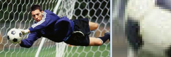
ball

What is it?
Joint Photographic Experts Group (JPEG) format is commonly used to display photographs and other continuous-tone images in HTML documents over the Internet and other online services. JPEG format supports CMYK, RGB, and Grayscale color modes, and does not support alpha channels. Unlike GIF format, JPEG retains all color information in an RGB image but compresses file size by selectively discarding data.

File Size/Compression?
A JPEG image is automatically decompressed when opened. A higher level of compression results in lower image quality, and a lower level of compression results in better image quality. In most cases, the Maximum quality option produces a result indistinguishable from the original.

Large Document Format (*.PSB)

What is it?
The Large Document Format (PSB) supports documents up to 300,000 pixels in any dimension. All Photoshop features, such as layers, effects, and filters, are supported. You can save high dynamic range, 32 bits-per-channel images as PSB files. Currently, if you save a document in PSB format, it can be opened only in Photoshop CS or later. Other applications and earlier versions of Photoshop cannot open documents saved in PSB format.

PCX (*.PCX)

What is it?
PCX format is commonly used by IBM PC compatible computers. Most PC software supports version 5 of PCX format. A standard VGA color palette is used with version 3 files, which do not support custom color palettes. PCX format supports Bitmap, Grayscale, Indexed Color, and RGB color modes, and does not support alpha channels.

File Size/Compression?
PCX supports the RLE compression method. Images can have a bit depth of 1, 4, 8, or 24.

Photoshop PDF (*.PDF*.PDP)

What is it?
Self explanatory, this file format saves the Photoshop file you are working on as a PDF file to be opened with Adobe Acrobat Reader.

Photoshop RAW (*.RAW)

What is it?
If you’ve saved the file in raw mode (when using a digital camera) when it is subsequently loaded into a raw conversion program and then saved to a TIFF or .PSD format file it can be exported in 16 bit mode. The 12 or 14 bits recorded by the camera are then spread over the full 16 bit workspace. If you’ve saved the file in-camera as a JPG then it is converted by the camera’s software to 8 bit mode and you will only ever have 256 brightness levels to work with.

File Size/Compression?
Files sizes are usually quite large as the name suggests the photo is in a RAW state therefore no compression has been done to it.

PICT File (*.PCT*.PICT)

What is it?
Image file saved in the Macintosh PICT format; may contain both vector and bitmap data and can use thousands of colors; also supports RLE (Run-length encoding) and JPEG compression to reduce the file size.

File Size/Compression?
File sizes are relatively small as it uses the same compression method as JPEG

Pixar (*.PXR)

What is it?
The Pixar format is designed specifically for high-end graphics applications, such as those used for rendering three-dimensional images and animation. Pixar format supports RGB and grayscale images with a single alpha channel.

PNG (*.PNG) - Lossless

This image represents how transparency is achieved in Photoshop:

transparent

What is it?
Portable Network Graphics (PNG) is a bitmapped image format that employs lossless data compression. PNG was created to improve upon and replace GIF (Graphics Interchange Format) as an image-file format not requiring a patent license, PNG also offers a variety of transparency options available.

Portable Bit Map (*.PBM*.PGM*.PPM*.PNM*.PFM*.PAM)

What is it?
The Portable Bit Map (PBM) file format, also known as Portable Bitmap Library and Portable Binary Map, supports monochrome bitmaps (1 bit per pixel). The format can be used for lossless data transfer because many applications support this format. You can even edit or create such files within a simple text editor.
While the PBM file format stores monochrome bitmaps, PGM additionally stores grayscale bitmaps, and PPM can also store color bitmaps. PNM is not a different file format in itself, but a PNM file can hold PBM, PGM, or PPN files. PFM is a floating-point image format that can be used for 32 bits-per-channel HDR files.

Scitex CT (*.SCT)

What is it?
Scitex Continuous Tone (CT) format is used for high-end image processing on Scitex computers. Contact Creo to obtain utilities for transferring files saved in Scitex CT format to a Scitex system. Scitex CT format supports CMYK, RGB, and grayscale images and does not support alpha channels.

File Size/Compression?
CMYK images saved in Scitex CT format often have extremely large file sizes. These files are generated for input using a Scitex scanner. It is often demanded in professional color work—for example, ads in magazines.

Targa (*.TGA*.VDA*.ICB*.VST)

What is it?
The Targa® (TGA) format is designed for systems using the Truevision® video board and is commonly supported by MS DOS color applications. Targa format supports 16 bit RGB images (5 bits x 3 color channels, plus one unused bit), 24 bit RGB images (8 bits x 3 color channels), and 32 bit RGB images (8 bits x 3 color channels plus a single 8 bit alpha channel). Targa format also supports indexed-color and grayscale images without alpha channels.

File Size/Compression?
When saving an RGB image in this format, you can choose a pixel depth and select RLE encoding to compress the image.

TIFF (*.TIF*.TIFF) - Lossless

What is it?
Tagged-Image File Format (TIFF, TIF) is used to exchange files between applications and computer platforms. TIFF is a flexible bitmap image format supported by virtually all paint, image-editing, and page-layout applications. Also, virtually all desktop scanners can produce TIFF images. TIFF documents have a maximum file size of 4 GB. Photoshop CS and later supports large documents saved in TIFF format. However, most other applications and older versions of Photoshop do not support documents with file sizes greater than 2 GB.

TIFF format supports CMYK, RGB, Lab, Indexed Color, and Grayscale images with alpha channels and Bitmap mode images without alpha channels. Photoshop can save layers in a TIFF file; however, if you open the file in another application, only the flattened image is visible. Photoshop can also save annotations, transparency, and multiresolution pyramid data in TIFF format. In Photoshop, TIFF image files have a bit depth of 8, 16, or 32 bits per channel. You can save high dynamic range images as 32 bits-per-channel TIFF files.

Conclusion

As you can see some of the file types are redundant unless you have specific software/hardware and most of you wont ever need to use them, but now you know what they are and what they do, so if you ever need to know what file type to use for a project check back here and you can find out which is best!

If there is any information here that you feel to be incorrect or would like me to add then leave a comment on the bottom and I will moderate what I think needs adding/deleting.

Helvetica - Why is it SO Popular?

by Steve Tolley

The other day I was thinking about what font to use for a some Photoshop work I was doing, and whilst searching through the many different fonts I had, the one that jumped out at me was Helvetica I don’t quite know what it was about the font that stood out so much to me, was it the simplicity, the beauty or something else, this got me thinking and so I did some research…

First let’s look at some of Helvetica’s history,

Who Developed It?

Helvetica was developed in 1957 by Max Miedinger with Eduard Hoffmann in Münchenstein, Switzerland.

The font was originally called Neue Haas Grotesk based on a typeface called Schelter-Grotesk, the main aim of Helvetica as a typeface was to create something that was quite neutral and could be used on a wide variety of signage.

The Name was changed to Helvetica in 1960 which was derived from Confoederatio Helvetica which is the Latin name for Switzerland, this was an idea to make it more marketable internationally.

Variations

Neue Helvetica is a re-working of the original font done in 1983, this style of Helvetica offered more structurally unified set of heights and widths, this was developed at D. Stempel AG which was the daughter company of Linotype, there are also other redesigns which include improved legibility, heavier punctuation marks and increased spacing in numbers.

Where Is It Being Used?

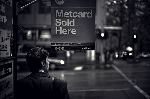
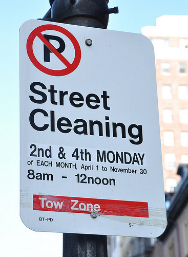
To put it simply… Everywhere!

It is a widely used typeface which has been designed for the following alphabets/scripts Latin, Cyrillic, Hebrew, Greek, Japanese, Korean, Hindi, Urdu, Khmer and Vietnamese.

It is being used in big companies such as AT&T, Microsoft, Panasonic and NASA also use the typeface on the side of their space shuttles!

When you’re walking down the street next, stop and look around to see how many places are using Helvetica as a typeface for their company, or simply try and spot some Helvetica near you, I bet it won’t be long until you can see some!

So Why Is It So Popular?

There are many reasons why Helvetica could be classed as popular, because it is simple yet it still manages to keep the beauty and keeps design looking good, and it never seems to get old, after 51 years it is still as loved as ever.

Below I asked some fellow designers to tell me there reasons why they think Helvetica has been so popular and why they like using it in their design work:

Andrew Taylor (Additive Designs)

Twitter: http://www.twitter.com/Additive

Andrew explains why he thinks it is popular and the reasons he fell in love with the typeface:

It’s a good type face. It’s generic and fits well with everything, but at the same time has those beautiful little nuances that stand out; I’m specifically thinking of the lowercase a and the uppercase R.

My personal obsession with Helvetica started with seeing the movie; it was fantastic! I was already heavily drawn to typography so it was natural that I would fall in love with that movie and it’s type face. For awhile I used Heltetica exclusively, haha. I was already enamored with Josef Mueller-Brockman and David Carson; I was torn between the idea that everything had it’s place and that you can create something beautiful from anything (kind of like the Punk ideal of how even ugly can be beautiful). I used Helvetica for clean, modular layouts and then I have pieces on my wall from a very David Carson inspired piece set entirely in Helvetica.

I think designers love the flexibility of Helvetica. I’m well aware it isn’t the only type face like that and I actually haven’t used Helvetica in months; I’ve been hand lettering everything, but the neutraility of the type face makes it very appealing. The neutrality and the repition; I belive many people use it simply because it’s all around us so it must be a safe choice. It’s minimalist, it’s corporate, it’s cold, but at the same time it can be so powerful, emotional and moving when used just right.

Adelle Charles

Website: http://www.fuelyourcreativity.com

Twitter: http://www.twitter.com/adellecharles

Adelle simply put:

I think it’s popular in the design community because it’s been around for over 50 years & it meshes well into projects. There are so many typefaces out there that are so popular, but the signature of the designer is in all of the work.

She also left this quote by a famous designer:

“Helvetica leaves you with just the shapes. Other typefaces give you that but with other characteristics, whereas Helvetica is reduced down to just letters,” says Saville

Selene M. Bowlby

Website: http://www.idesignstudios.com/blog/

Twitter: http://www.twitter.com/idesignstudios

Selene went into detail about why she thinks it’s as popular as it is:

Helvetica is just one of those fonts - it’s clean, it’s simple, it’s versatile… It’s a font that can work well in many different applications.

With so many variations on the font, it can be used in many ways - each version capable of giving a completely different look and feel to a design.

I’m personally fond of clean / simple designs, often going for a “less is more” approach with many of my own creations. I especially like the thinner versions of Helvetica Neue, and use it on my own website, as well as on a few of my client web sites.

Although simple, Helvetica is still a stylish and highly readable font… simply put, it’s a classic that I don’t think will go away any time soon!

So there you some great responses as to why top designers today still think the font is popular within the design community even after 51 years!

In my opinion I think it is beautiful yet so simple and effective that it can bring any design to life and still give it the WOW factor that so many people crave when designing, and I can’t see it going anywhere just yet…

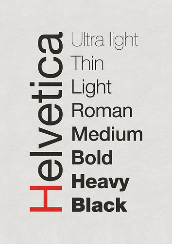
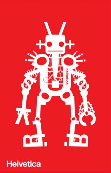
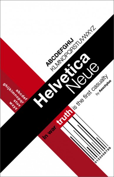
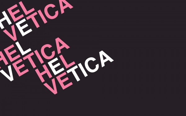
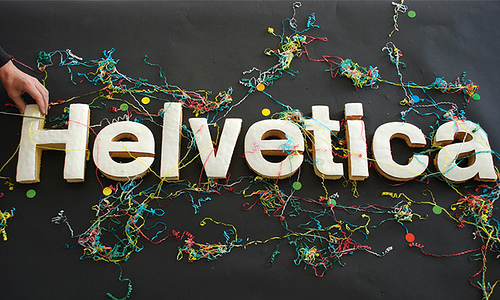
Here are some examples of Helvetica being used in everyday life and in design itself,

The Movie

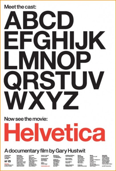
Yes thats right a movie about a typeface, sounds weird doesn’t it? But actually it is a great movie, where top designers explain where Helvetica fits into their design life, here is an explanation of the film from the website:

Helvetica is a feature-length independent film about typography, graphic design and global visual culture. It looks at the proliferation of one typeface (which recently celebrated its 50th birthday) as part of a larger conversation about the way type affects our lives. Helvetica is currently screening at film festivals, museums, design conferences, and cinemas worldwide

The film which was originally released last year (to celebrate Helveticas 50th Birthday) was a massive hit and being very popular within the design community, to read more about the film and to buy the DVD etc…visit the official Helvetica Film website HERE

Below is an example of some of the designers you can expect to see in the movie:

Erik Spiekermann, Matthew Carter, Massimo Vignelli, Wim Crouwel, Hermann Zapf, Neville Brody, Stefan Sagmeister, Michael Bierut, David Carson, Paula Scher, Jonathan Hoefler, Tobias Frere-Jones, Experimental Jetset, Michael C. Place, Norm, Alfred Hoffmann, Mike Parker, Bruno Steinert, Otmar Hoefer, Leslie Savan, Rick Poynor, and Lars Müller.

Some Helvetica Inspiration

So to finish off this post on Helvetica I will show you some Helvetica pieces to inspire you…Enjoy!

To Conclude

I think using Helvetica brings a piece of design to life just because it is so simple and yet it means so much to so many people! I know one thing is for sure, I LOVE IT!

What do you think?
Do You Love it or Hate it?

Leave a comment below and let me know what you think!

17 of the Most Visually Beautiful HDR Images

by Steve Tolley

After a break for a little while, and concentrating on my University Assignments I am back with another collection of inspirational and stunning images, this time its a collection on beautiful HDR images,

What is HDR?

High Dynamic Range. An HDR image aims to store pixel values that span the whole tonal range of real-world scenes. In order to create such an image several low dynamic range (ie ordinary digital photos) taken at differing exposure values are combined.

This process then gives amazing images that have a full range of tones and colours, which look truly amazing as can be seen in the collection below, I hope you enjoy them:

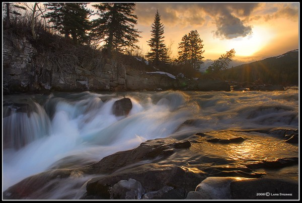
Waterfall

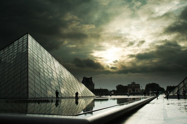
HDR at Le Louvre

Andalucia

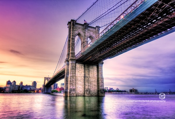
Brooklyn Bridge

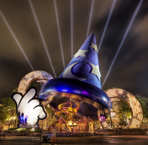
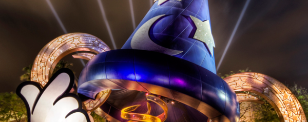
The Magic of Disney

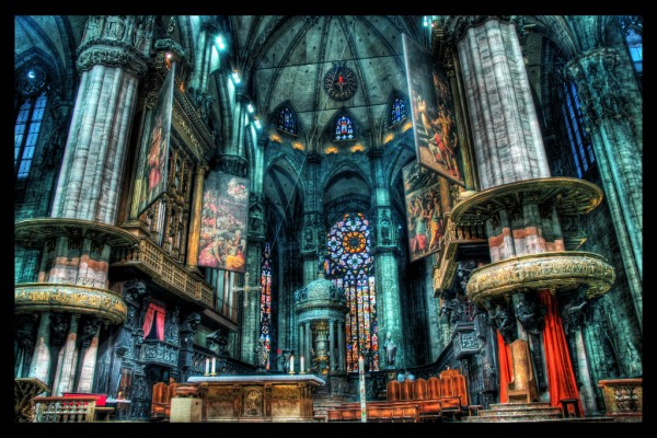
The Airy Doom of the Duomo

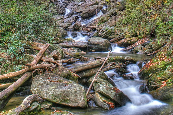
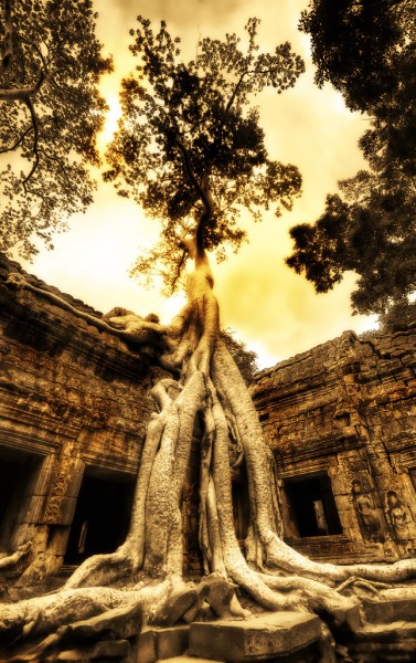
Autumn Stream

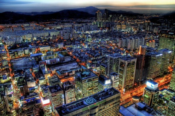
The Seoul of a Sunset

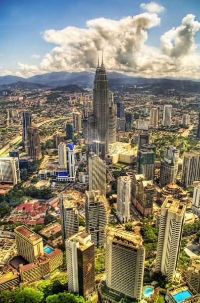
Farewell Kuala Lumpur

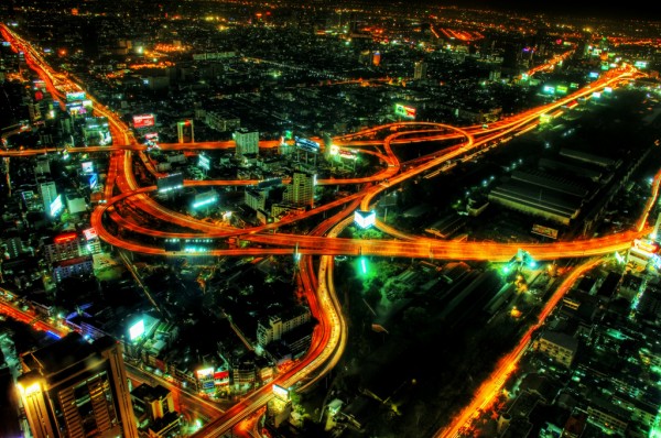
The Veins of Bangkok

Modern Day Loneliness

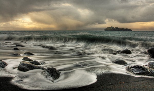
The Powerful Sea

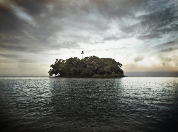
Treasure Island / The Island

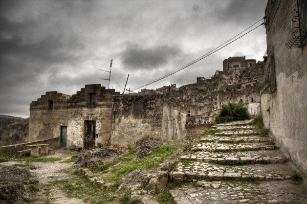
Abandoned Matera

Swallowing The Ruins

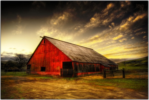
Barn

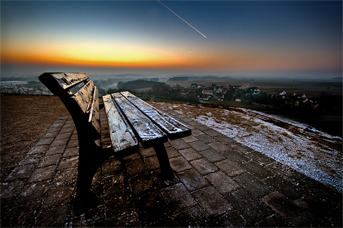
Bench Lighting

Other HDR Collections:

Monthly Roundup - September 08

by Steve Tolley

September has been a crazy month for me, getting prepared for university, trying to maintain this website, starting university and getting stuck in as well as releasing a second website it has all really kept me on my toes, hence the reason for the lack of posts/tutorials over the past week or two, hopefully things are settling down now and I can resume normal posting, roll on october…

But for now this is a round up of the best of the month just gone:

Tutorials

Lets start off with some of the best tutorials from this month, in no particular order:

Screen Shot Magic - MagnusFX

A great tutorial explaining how to spruce up dull screenshots by introducing some Photoshop magic

The RoboHorse - Tutzor

A very unique tutorial explaining how to turn a normal picture of a horse into a cool looking RoboHorse

Create a Shiny 3D Box - PSVibes

A very cool tutorial on how to make a 3D box icon that can be applied to many different designs/websites

Business Card on a Wooden Texture Table - NaldzGraphics

A nice tutorial showing how to realistically present your business card designs

Vibrant Photo Manipulation - PSDLearning

A fantastic tutorial explaining how to manipulate a photo to give a great colouful end result

Create An Amazing Ad In Photoshop - Abduzeedo

Possibly my favourite tutorial this month not just because of the amazing end result but the simplicity of the techniques used to get such a great effect

Articles

Now for some of the best design based articles, this was tough as there was so many to choose from but I just picked a few:

What Not To Do When Designing A Logo - Brian Yerkes

A great article explaining what not to do when designing a logo, informative and interesting, well worth a read

Web Design Inspiration: Brown - Design Shard

A nice inspirational article for web designers looking at brown coloured sites for inspiration, also Design Shard has just undergone a facelift and looks great check it out…

Talking Typography Part 1 - Arbent

A cool article looking at what different types of typography are used and how they are implemented

Resources

And finally some resources for you all to look at and use,

Out of Focus: 30 Free Bokeh Textures - Lost And Taken

A collection of great textures in the Bokeh style really useful and very nice

20 Free Handwritten Fonts - Fuel Your Creativity

A great collection of handwritten fonts useful for the more personal, scrapbook style look to a design

New Design Websites:

Just a quick shout out about a couple of new design related websites that have popped up this month:

The Creativity Wall

My latest website, that I officially released this month, a showcase for design related articles that will double up as a design database if you are ever looking for a design article or for a particular tutorial then this is the place to go, alternatively if you want to showcase your work here then simply submit it to me and I will upload it as soon as I can, gradually getting more subscribers and visitors per day, so get submitting to increase the amount of articles available…

Vot.eti.me

A great new website from Roger who also owns Styl.eti.me this website however is like a digg style site for designers and creatives, new links everyday and ever growing, well worth submitting your links to to attract fellow designers.

Thats it for September I hope you enjoyed this roundup and lets hope October is as good for the design community and keep the great articles and tutorials coming, I will surely try my best to create some good tutorials in the following month.

Best of The Week - 15th To 21st September

by Steve Tolley

As of this week every sunday I am going to produce a ‘Best of The Week’ Selection where I will look through the weeks top Tutorials, Articles and Resources and produce a list of the best ones found, This being my first some feedback in the comments would be appreciated to say whether or not you like the idea,

Tutorials

Awesome Billiard Balls

Unique 3D Text - Xara 3D + Photoshop

Banging Woofer Embedded In Wood

Pencil It In

Make an Inspiring Artistic Poster

Articles

Your Rights As A Photographer

40+ Creative, Courageous and Campy Buttons

18 Truly Awesome Cool Custom Designer T-Shirts

Resources

Hand Drawn Fonts Collection

10 Beautiful Icon Sets For Web Developers and Designers

35 Tutorials For Mastering Photoshop Brushes

I hope that you have enjoyed this collection from this week and that it helps you along the way, if you want to see a ‘Best of’ every Sunday then leave a comment below saying how much you have enjoyed this one and I will keep on doing them.

Top Designers and THEIR Inspiration

by Steve Tolley

In the 2nd part of my design inspiration article series I asked 2 TOP Designers/Photoshoppers to let me know what inspires THEM in order to see how they come up with their ideas and what artists, websites, sources etc…they use, here are the answers that I got,

David Leggett - Tutorial 9

Tutorial 9 is a fantastic website offering top quality Photoshop Tutorials and resources, and home to the famous Photoshop School which will teach the beginner how to progress in Photoshop with exams at the end of each grade.

My work is mostly web based, so I do a lot of web design, interface design, etc. My goal as a designer is to balance compelling media with a usable interface. When it comes to inspiring myself, I like to browse through online galleries like http://screenfluent.com/, http://www.designflavr.com/, http://www.behance.net/, and see what friends are doing on Flickr.

Screenfluent

DesignFlavr

Behance

A lot of my inspiration comes from outside the web though. For example, I greatly admire the folks who design magazines like WIRED - who really use unique grids in their work to create page layouts that are really creative and out of the ordinary. Along with magazines, I like collecting album art, cool package/product designs, and flyers/business cards.

I’ve got a bunch of really artistic friends that are fun to watch as well. Whether I’m bouncing ideas off them, or if they ask for my opinion on their work, I find myself being inspired all the same.

Last, but not least, scenery is a great tool for me. Not just nature, but taking in an entire scene of just about anything, and observing how things fit together or stand apart from each other. Skylines, Offices, the Outdoors, anything really.

Adelle Charles - Fuel Your Creativity

Fuel Your Creativity is a website dedicated to design and web resources, offering great links to cool websites, Adelle describes her site as being: “An open forum where everyone is welcome (and encouraged!) to exchange ideas and tips. It’s not just for designers either. Writers, photographers, graffitists…come one, come all.”

PatternTap

This site is such a great resource for all types of design. Everything is broken down into categories or sets to quickly find the type of inspiration you’re looking for. When I’m working on website comps, I usually visit the “articles” & “layout” category and when gathering research for fuelyourcreativity.com posts, I head over to the “typography” section.

WebDesignerWall

Amazing articles on web design to get your creative juices flowing. The site itself is inspiration! Great site to visit daily for design trends, ideas and tuts.

Faveup

Great place to look at Logo designs, Business Card Designs & Flash Websites which are all user submitted. Another great inspirational site made by the folks over at Envato. I primarily use faveup to check out logos & business cards.

BestWebGallery

One of the best showcases around to draw inspiration quickly. They have some of the best looking sites listed and my favorite part about the site (or most useful) is the rollover (very fast) screenshot view. In most cases if I don’t like the quick view - I keep on going.

Typesites

Tasty sites focused on typography. What can I say; sometimes those are the best looking sites! Great inspiration and go to when you’re stuck on layouts.

Twitter

Believe it or not - I gain inspiration from the people I follow on twitter. No it’s not a gallery, but if you utilize twitter in the right way, you can get a lot of opinions on things fast and check out what other people just like you are doing, reading, surfing & talking about. This has been one of the best tools for me & inspiration on blogging or even what to blog about.

Design Inspiration from Other Top Designers

Both of the above have done posts on what inspires them and how to best utilize the web in order to get the most out of the inspiration available to use, so just click on either of the above links to find even more inspiration sources etc…

Useful Designers to Follow on Twitter

Some of the most useful and influential people to follow on twitter are listed below, this is because they offer good feedback on work and generally tweet about interesting articles around the web, which offer more inspiration and some general fun along the way,

And then there is always me, I try my best to help my fellow twitterers, so head over to MY TWITTER PAGE and click the little follow button,

Thats all I have for this article, hope you enjoyed it and that it has helped you find that much needed inspiration, when I was making this article I enjoyed looking at the websites that these designers use and have bookmarked my favourites to help me when I need inspiring.
Design Inspiration - Posters

by Steve Tolley

This article will get your desiging juices flowing, Part 1 in a series of design inspiration articles, this one will look at modern and old posters, I have hand picked the ones that I believe are the best at giving you ideas, they have certainly given me some,

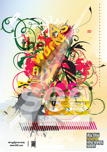
1 - As The World My Eyes See

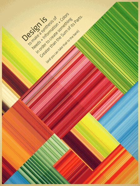
2 - Design Is…

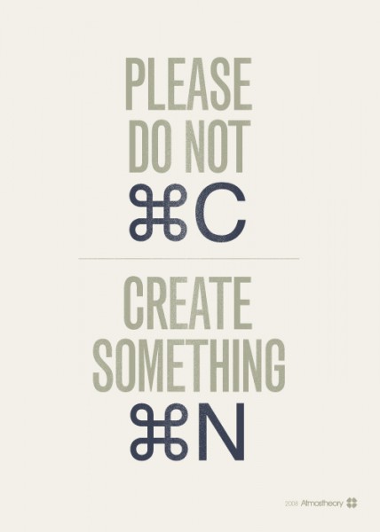
3 - Do Not Copy, Create Something New

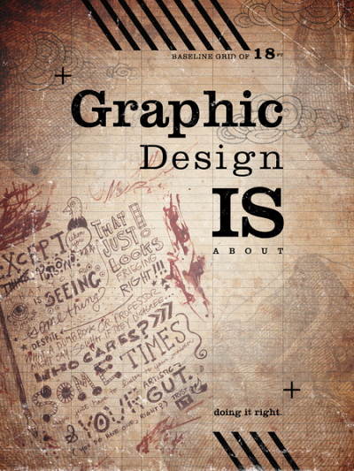
4 - Graphic Design Is About…

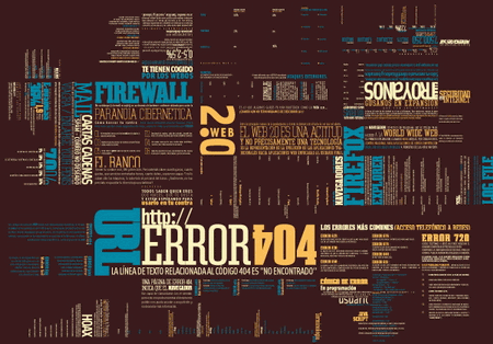
5 - Error 404

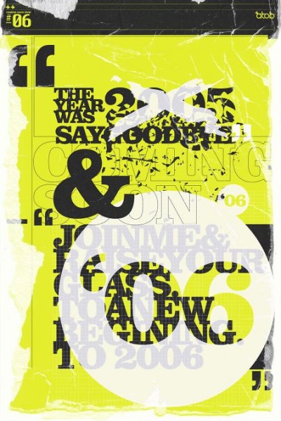
6 - Coming Soon

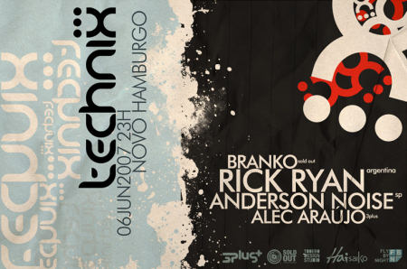
7 - Technix

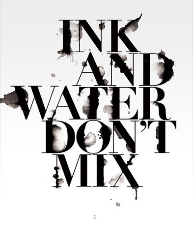
8 - Ink And Water Don’t Mix

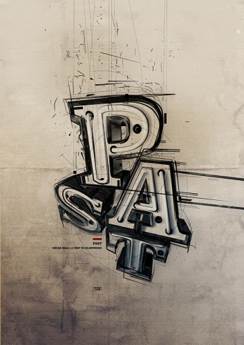
9 - Past

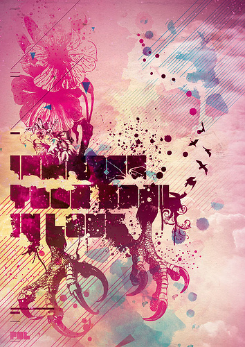
10 - Love…

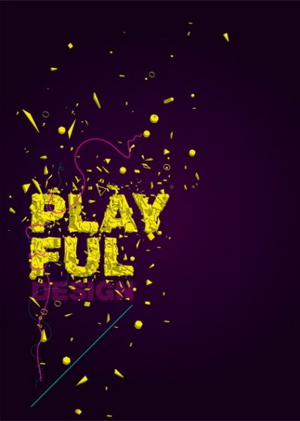
11 - Playful

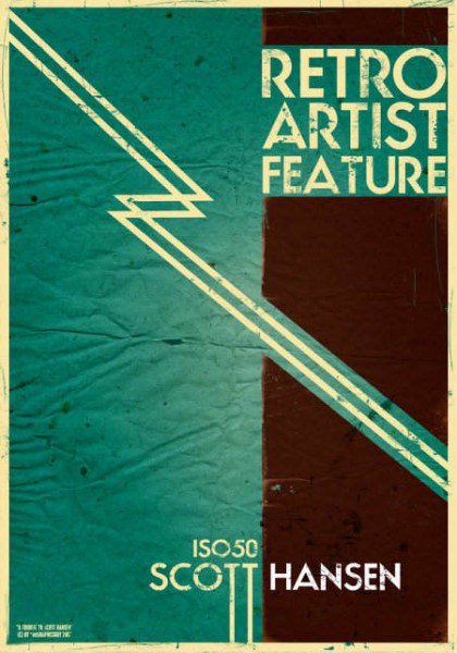
12 - Retro

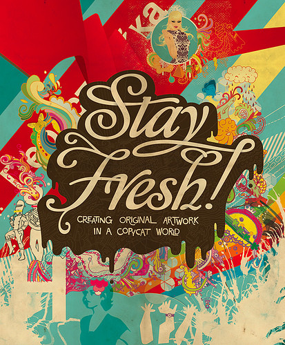
13 - Stay Fresh

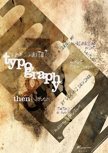
14 - Typography

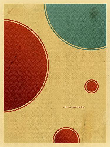
15 - What Is Graphic Design?

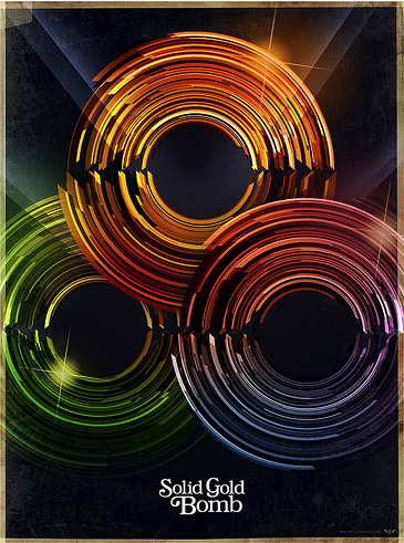
16 - Solid Gold Bomb

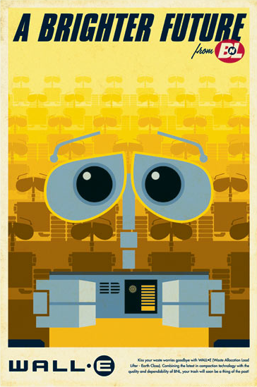
17 - Wall-E

18 - Gill Sans

19 - Formality

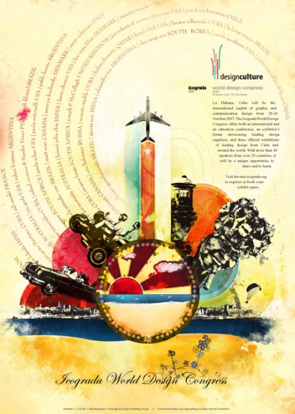
20 - Design Culture

And there you go, I hope you all have enjoyed looking at this collection of posters and that you are now in the mood to go and get some cool designs done, Part 2 will be design inspiring websites, so make sure you sign up to the RSS Feed so that you don’t miss it.

15 Of The All Time Best Text Effects

by Steve Tolley

This article is rammed full of the 15 BEST text effects around at the minute, it has taken me a while to filter out the best text effects from the not so great ones, even though there are alot of fantastic ones out there they can’t quite compete with the quality of these ones, and yes the majority are from sites such as PSDTuts and Tutorial9 as these do produce tutorials of the highest quality so here we go…

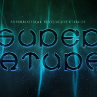
1. Super Natural

A fantastic text effect tutorial to start us off with, this tutorial takes advantage of the Wave Distortion filter in Photoshop to give an eerie supernatural text effect.

2. Flaming Meteor Effect

This tutorial takes text effects one step further and makes it look as though your text is truly falling from the sky in a ball of flames, this tutorial was written by Fabio who also owns Abduzeedo which I must say is a fantastic website for similar effects.

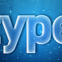
3. Transparent Glass

This tutorial shows us how to simply but effectively create a transparent glass effect for our text which finishes up to be a very realistic outcome, what else do you expect from PSDTuts?

4. Smooth Glass

This tutorial is similar to the previous one in the list but then again the end results are very different, but another great tutorial blending together rather simple techniques to bring such a professional and realistic outcome.

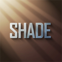
5. Using Light And Shade To Bring Text To Life

This tutorial is not as such a text effect but how to bring your text to life by using light and shade and again the outcome is amazingly realistic.

6. Light Burst

This tutorial has been around for quite a while now and has been very popular but is still classed in my eyes as one of the best text effects as the simplicity coupled with the great outcome makes it stand out from the rest.

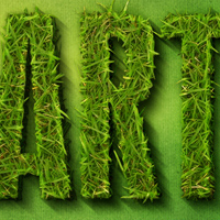
7. Earth

A fantastic text effect again from PSDTuts this shows us how we can use actual images placed on top of the text to create a fantastic end result, this is also one of my favourite tutorials because of it’s realism.

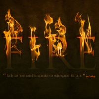
8. Dramatic Fire

This fire effect makes this stand out from the rest simply for the fact of  how well it is implemented into the text and how an image of fire can be used to make a truly realistic outcome compared to computer generated fire.

9. Snow N’ Ice

Another favourite of mine because of the cartoony effect this gives, I can see this being used in a poster for a wintery cartoon/movie for instance Ice Age and a result that can be gained so simply.

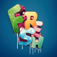
10. 3D Typographic

An effect which has also been around for a while but again still one of the best out there, this combines the use of a 3D program called Xara 3D, this creates letters with realistic lighting and shadow, these letters are  then imported into Photoshop to make them look as good as they do.

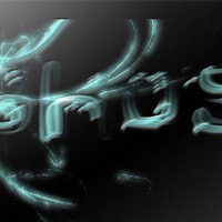
11. Ghost

A not so well known tutorial but one that I think results in a fantastically creepy ghost effect which can be implemented into many scary designs/images

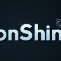
12. MoonShine

A relatively new text effect in the tutorial world but one that stands out from the rest simply due to the fact of the professional looking outcome and simple techniques that can be learned from this tutorial.

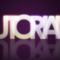
13. Colourful Glowing Text

Again another new text effect but one that is explained so well, from Tutorial9 which is a fantastic website full of inspiring tutorials and great effects.

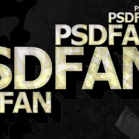
14. Grunge

A great effect in this tutorial showing how to create a fantastic grunge style text effect using textures and layer styles from a great website that looks to be going to same way PSDTuts has gone with it’s popularity.

15. Layered Glowing Effect

And to finish another fantastic tutorial from PSDTuts this effect uses multiple layers to create a truly spectacular glowing effect which I can see myself using in future projects.

Summary

To summarise as you can see all of these tutorials are of the highest quality and A LOT can be learned from them which can then be used in your own projects/designs, I would like to say a big thanks to all of those people who have taken their time to create such fantastic inspiring tutorials and hope that my tutorials can one day match the quality and standard of the ones shown in this article.