Creating A Grungy Banner
This tutorial will show you how to create a grungy style banner that can be used on posters or on websites, it is a very simple process and therefore quite a short tutorial but offers techniques which can be used on any project,
What We Are Going To Achieve
Step 1 - Create New Document
First of all as always you need to create a new document for this tutorial I have used the sizes 500 x 500 but as normal you can use whatever size is suitable for you, once you have this then fill the document with the colour #FFFDE6
Step 2 - Draw Some Rounded Rectangles
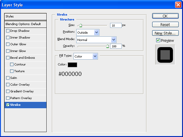
This step is simply to draw 2 rounded rectangles using the rounded rectangle tool (shown below) so make sure that your foreground colour is set to #FFFDE6 and draw a rounded rectangle with a radius of 5px, when this is done double click the new shape in the layers tab which will bring up the blending options menu, with this open use the below settings:
Stroke:
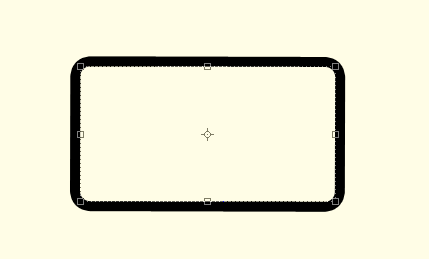
With these settings applied you should have something similar to below:
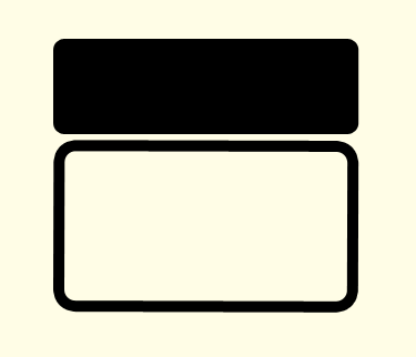
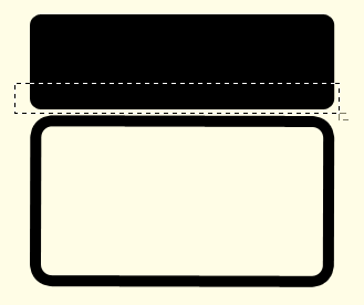
Now we need to draw our second rounded rectangle, this time make sure that the foreground colour is set to black (#000000) and draw a shape the same as below:
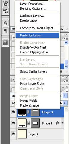
Now right click in the layers panel on the second shape and choose rasterize layer as shown below:
With this done select the Rectangular Marquee Tool (Shown Below) and make a selection the same as what I have done below:
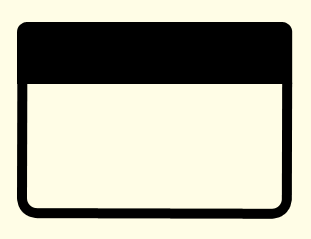
When you have the same selection simply press delete (Note: Make sure that you have the second shape layer selected otherwise it won’t do anything) when this is done you should have a shape with a flat bottom which then needs to be positioned on top of the other shape as shown below:
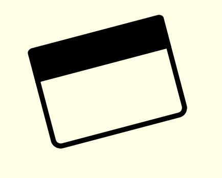
Now to finish off with these two shapes select both of the in the layers tab (CTRL + Click both of the layers) and then choose the Move Tool and rotate the two layers so that you have the outcome below:
Step 3 - Adding The Brushes
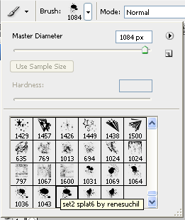
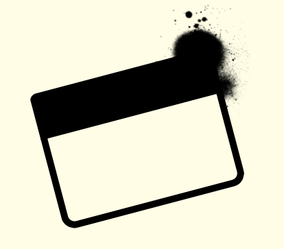
The first brush set we are going to use can be found on Brusheezy but to save you time finding it there is a link to it HERE, once you have downloaded the brushes load them into Photoshop and use the brush shown below:
With this brush selected create a New Layer (CTRL + Shift + N) and set black as your foreground colour and then press the ” [ ” key on your keyboard this will make the brush go smaller, I made mine go to 200px and the applied it to the top right hand corner of the rectangles we created earlier:
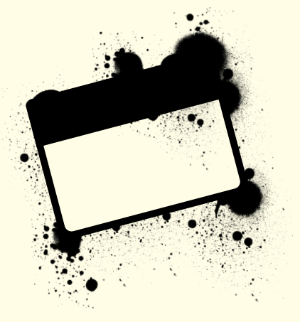
Now you have the basic principle you can play around with the different brushes in the pack and apply them all over the shape, but make sure to create a new layer for each separate brush as this allows you to change them later if needed, when I had finished playing around I had something like below:
Now if you wanted you could change the foreground colour of the brushes and apply some more around the rectangles to make it look more warn like below:
Next we need to add the second set of brushes which can be located and downloaded HERE and then we can start playing around with these brushes, there aren’t a lot in this set so just choose the brushes that you like the best and apply them on your banner, you can use the below image as reference (Note: Make sure the foreground colour is set to black #000000)
As you can see it is just a case of experimenting where you want the brushes to go and where looks good, when you have something you are happy with then we can move onto the final step.
Step 4 - Adding The Text
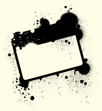
Now it is just a case of adding some text to the banner I simply added the name of my website like below (Note: I used the Font TW CEN MT Condensed Extra Bold) when the text has been been added simply rotate as before and place inside the of the banner:
Now to finish off you can some more of the splatter brushes over the top of the text which would help make the text look worn and grungy like the rest of the image and when this is done you have the finished product like below, this could be used for posters or websites the list is endless:
And as always if you have any problems with this tutorial then don’t hesitate to leave me a comment or email me at: stevie489@googlemail.com and I will help you as much as I can…
