The “Love Design” iPhone Wallpaper

by Steve Tolley

This tutorial will teach you how to make a cool “Love Design” wallpaper for you iPhone, obviously not everyone has an iPhone so if you wanted you could use the techniques and scale it up to a wallpaper for you desktop for instance, the main idea is to teach you how to get cool effects.

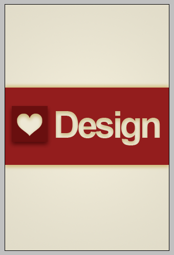
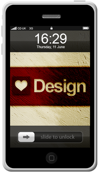
This is what we will be making:

Final

Step 1 - New Document

First of all we need to create a new docurment, with the sizes 320 x 480 (W x H) in pixels, this is size needed for it to fit on the iPhone screen and leave all other settings as default.

Step 2 - Gradient Background

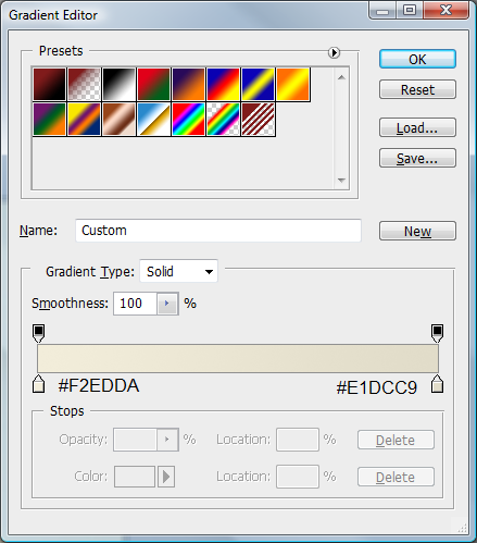
Next we need to create a gradient on the background layer, to do this select the gradient tool in the left hand toolbar and use the below colours:

Gradient Settings

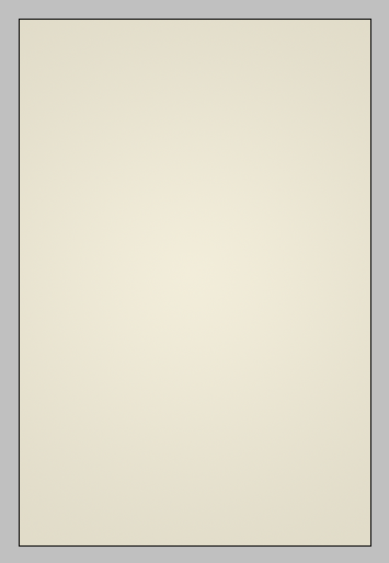
And make sure that the radial gradient is selected, when this is done click in the middle and drag to any corner of the canvas and let go to get your gradient like below:

Gradient

Step 3 - Draw First Rectangle

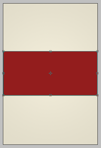
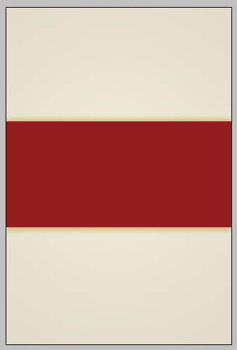
When this is done, make sure the primary colour is set to #931D1D and draw a rectangle across the canvas as shown below:

First Rectangle

Step 4 - Shadowing

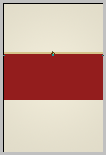
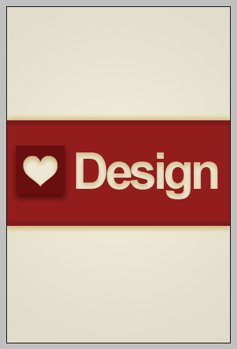
Now we need to create some shadowing to do this set the primary colour to #D5C38A and draw a rectangle in the same way you did with the first one but draw it a lot thinner and at the top of the first one as below:

Small Rectangle

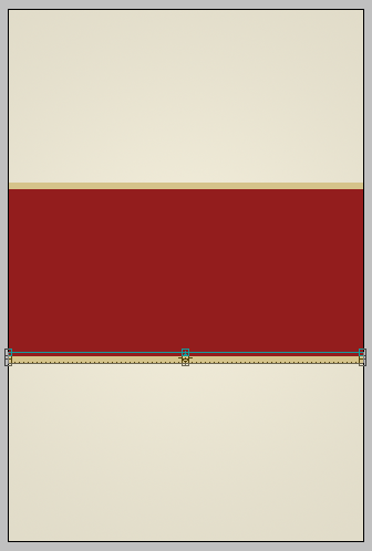
When this is done press (CTRL +J) to make a direct copy of the selected layer and move it to the same place but at the bottom of the first rectangle as below:

Small Rectangle 2

With this done, select the first small rectangle you drew and go to Filters > Blur > Gaussian Blur and set it to 3, and then do this process again with the second small rectangle and you should have something like this when done:

Small Rectangle blur

Step 5 - Adding The “Love Heart”

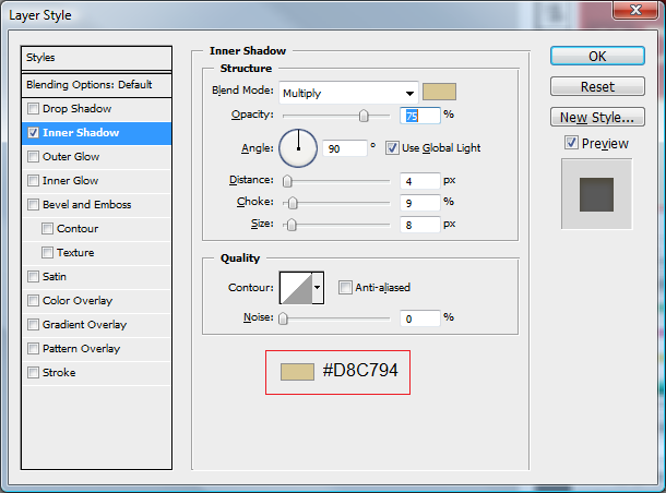
Next we need to get the heart, I did a quick Google search for “love heart” and found a suitable one so I put it into the document and resized it to fit where I wanted it to go, after this use these settings below using the blending options to get the right colour and effects:

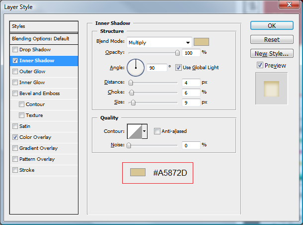
Inner Shadow

Heart Shadow

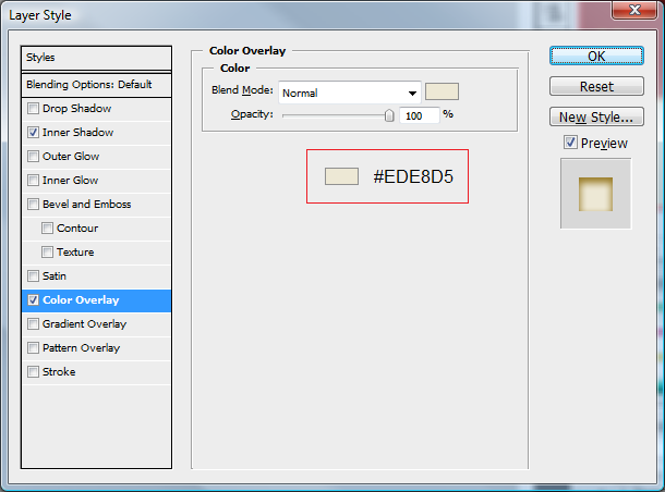
Color Overlay

Heart Color

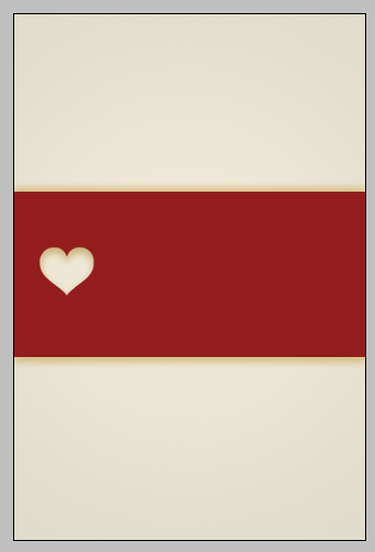
When these are done you should be left with something like this:

Heart Done

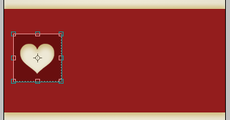
Step 6 - Creating A Square

Next we need to create the box that goes behind the heart this is simple, choose the rectangle tool again and set the primary colour to #690F0F and hold shift and click and drag a box around your heart so that the heart fits nicely inside the box as below:

Heart Box

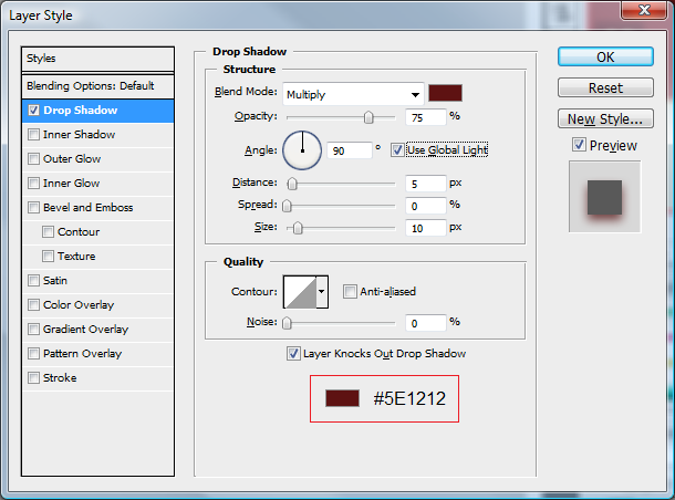
Once you are happy with the size put the below settings on the layer using the blending options:

Drop Shadow

Heart Box Shadow

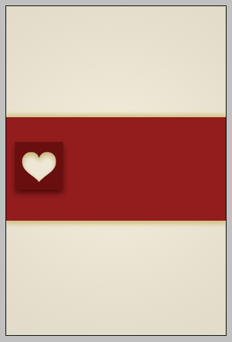
Once these are done you should be left with the below:

Heart Box Done

Step 7 - Add The “Design” Text

Next we need to add the design text, this is simple pick the text tool on the sidebar and select the Arial font and make sure it is bold, next to where you have placed your heart click and write the word “Design” when this is done use the settings below (again using the blending options) to get the right effect:

Text Shadow

When this is done you will have something like this:

Text Done

Step 8 - More Shadowing

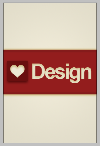
The penultimate step is to create some darker patches at the top and the bottom of the original rectangle this is again to give the idea of shading, to do this do the same as the other two small rectangles (Step 4) but use the colour # 801B1B and place them just inside the top and bottom of the original rectangle:

Shadowing 2

When this is done again apply a Gaussian blur of 2 with this done you will have this:

Shadowing 2 Blur

Step 9 - Adding Texture

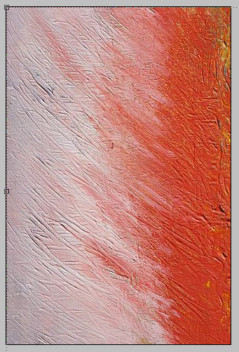
The final step is what makes this wallpaper comes and alive, as we all know textures make things jump out and give things depth, so what we are going to do is add a texture I again found THIS cool texture, of paint on a canvas, copy this and paste it onto the canvas and place around this area (with the top left of the image in the top left of the canvas)

Texture

With this in place make sure the texture layer is selected and go to Image > Adjustments > Black & White and then set the layer mode to Color Burn this will give you the finished wallpaper as shown below:

Final

iPhone Test

Also below is what the wallpaper will look like on the iPhone:

Wallpaper Test

If you want to know how to make the iPhone itself, leave a comment on this tutorial and if enough people want to see how it’s done then I will make it for the next tutorial.

It would be cool to see what you come up with so feel free to upload them to the Photoshop Tutorials Flickr Group and leave me a comment to say when you have uploaded one so people can comment on them,

And as always if you have any problems with this tutorial then don’t hesitate to leave me a comment or head over to the Online-Photoshop Tutorials Forums and post in the Tutorials Problems section and I and others will be able to help you.

http://forums.online-photoshoptutorials.com/

psd-download

The ‘Colour’ Wallpaper Tutorial

by Steve Tolley

This tutorial is an addition to the previous wallpaper tutorial I did, as that got such a good response I thought I would make another wallpaper this time using different methods to achieve quite a unique look.

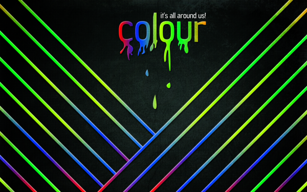
What We Are Going To Achieve

Step 1 - New Document

With this being a wallpaper tutorial you will need to make the canvas size the resolution of your screen, so therefore I am using the size 1440 x 900 but make sure you match it to your screen size and just go ahead and create a new document with these sizes.

Step 2 - Gradient Background

Now you need to fill in the background with a Radial Gradient, so pick the gradient tool off the sidebar and make sure that radial gradient is selected:

Now select the colours and set them to #243430 -> #000000 so that the greeney colour is on the left hand handle in the colour selection menu.

Step 3 - Texturing Background

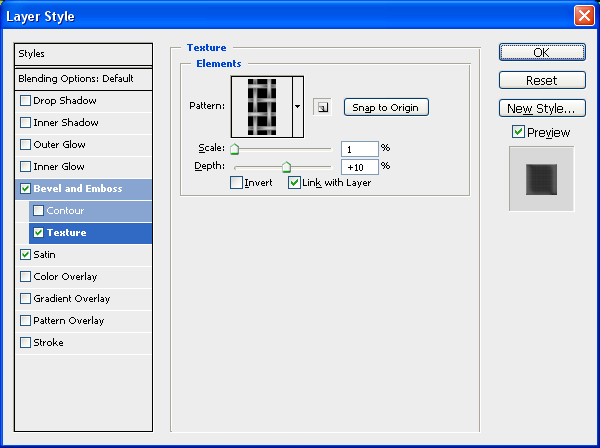
Now that we have the colour set we are going to add a slight texture to the background to make it stand out some more, so double click the Background layer in the layers tab which will then make it an editable layer, when this is done again double click the now called ‘Layer 0′ in the layers tab to bring up the blending options and use the settings below:

To get the below texture click the little arrow next to the preview and load the “Patterns” set of textures and choose the one shown below:

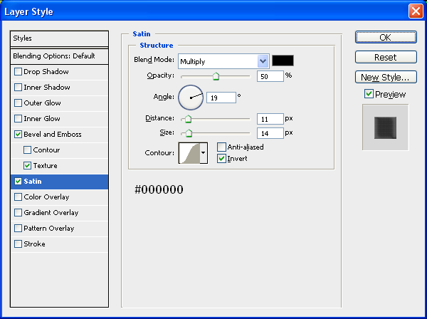
And finally add a satin effect to the background to darken it abit:

After applying all of these settings above you should now be left with something similar to below:

Click To Enlarge:

As you can see the texture really gives some depth and life to the image!

Step 4 - Adding The First Line

The main part of this image are the multiple lines that go diagonally across the image, this is simply one line with some blending options added which has then been repeated and manipulated to bring the sense of ‘colour’ to the image, to make this line we need to grab the rectangular marquee tool and draw a rectangle from one side of the image to the other:

Now we need to style it by adding the blending options:

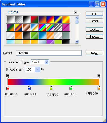
Gradient:

For the gradient try to match the colours as best you can, or you can use your own set of colours to match your style:

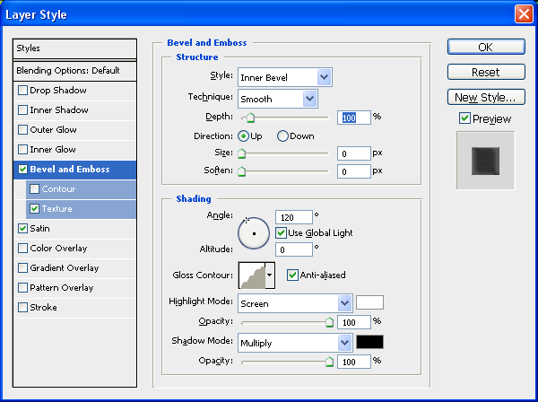
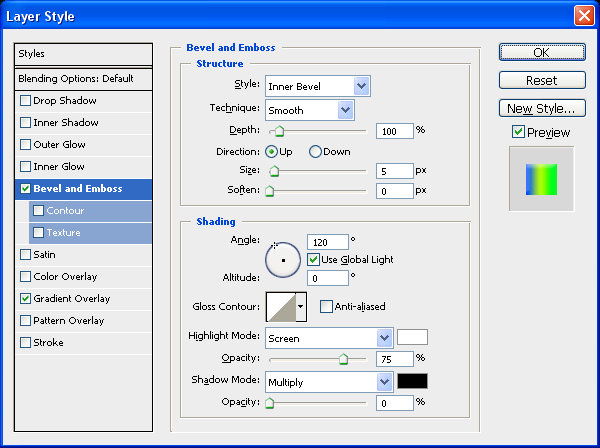
Bevel And Emboss:

And now a simple bevel and emboss, but we are going to remove the shadow from the option by taking the opacity down to 0% this is so that we get a nice highlight at the top:

Also add a simple drop shadow with all of the default settings to give some depth to the line

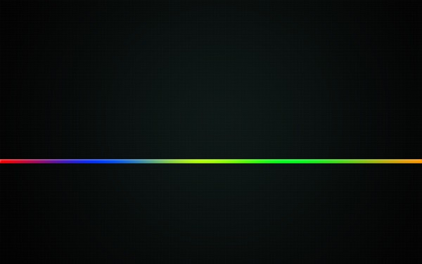
With these three blending options applied you will have a line across your image that looks like this:

Step 5 - Multiplying The Line Across The Page

The best thing to do here would be to press CTRL + J to duplicate the layer and then hide the original one by pressing the eye in the layers tab next to the original line layer, this is so that you have one there you can come back to if you mess up further on.

With the duplicated line you need to rotate it to a 45 Degree angle, to do this press CTRL + T to enter Free Transform mode and hold down shift whilst rotating the layer until it is at a 45 Degree angle, with this done place in the bottom right hand corner as shown below:

Now all there is to do, is duplicate the layer (CTRL + J) and reposition it above the one before it, and repeat this process until you have something similar to the image below:

TIP: Move the lines around a bit so that you get a different array of the colours rather than the same colour all the way through.

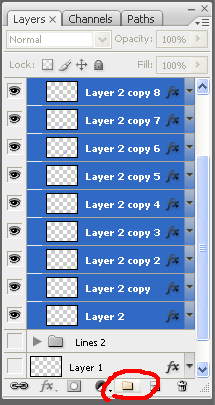
To create the lines on the other side of the image simply group together all of the previous lines layers and put them in a group:

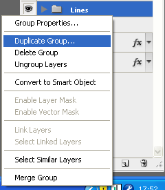
When the layers are in a group, the little folder icon appears with your group name, right click on this group and choose “Duplicate Group” which will make an exact copy of the group and call it something relevant e.g. “Lines Left”

Now with the duplicated group selected in the layers tab go Edit > Transform > Flip Horizontal which will flip all of the layers inside that group over, now choose the move tool and move to the left hand side of the screen and position in reference to below:

So they want to look like a mirror image of each other basically

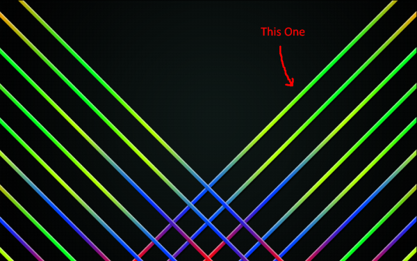
Next we need to cut off the bottom of the lines, to do this we need to highlight the top line on the right set (shown below) when we have this layer selected in the layer tab CTRL + CLICK in the box next to the layer name to get the crawling ants around it:

With the crawling ants around the line press CTRL + SHIFT + I to invert your selection, and the from the sidebar menu grab the magic want tool (making sure you still have the line selected in the layer tab) and then ALT + CLICK anywhere in the top left section of the image, this deselects this part and should leave the bottom right part of the image the only bits with crawling ants around.

With the bottom right selected select the group of the lines on the left and go through each of them pressing Delete to delete the part of the lines that are crossing over and you SHOULD be left with something similar to below:

(Note: The group of lines on the left need to be placed under the group of lines on the right in the layers tab so that they don’t appear on the top of the lines on the right)

That is the lines finished with although you can mix and match the colours if you wanted to

Step 6 - The Text

This part involves writing out the text and adding the drips to it which is basically drawing drip like shapes below the text using the pen tool,

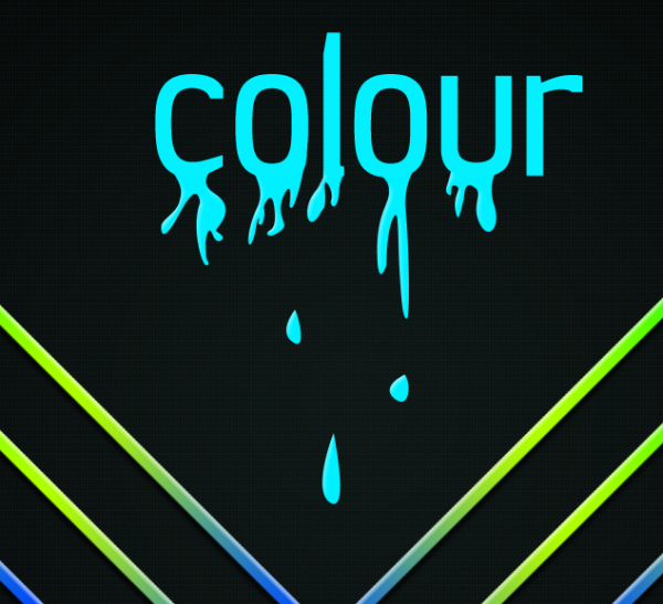
I chose the word “Colour” because I think it is what best describes this wallpaper so I proceeded to grab the text tool from the side toolbar and wrote the text in the middle at the top of the image, I used the font Jesaya for my text and then wrote the word colour, all in lowercase

(Note: As I am english I am spelling it the english way but you can spell it however you want to)

Now you should have something like below, note also that it doesn’t matter about the colour of the text at the minute as we will be adding a gradient to it later:

Now grab the pen tool and draw a drip like shape coming from the bottom of the letter “C”

(Note: Not all drips will be the same so play around and experiment with your own shapes and drips)

With this done I had something similar to below:

Now proceed to do the same with the other letters and remember to be creative with your drips and you can even miss letters out if you wanted it’s entirely up to you, when you are done playing you will have something similar to what is shown below:

(Note: I also added some drips below the text to give the effect that it was falling off the text drips above)

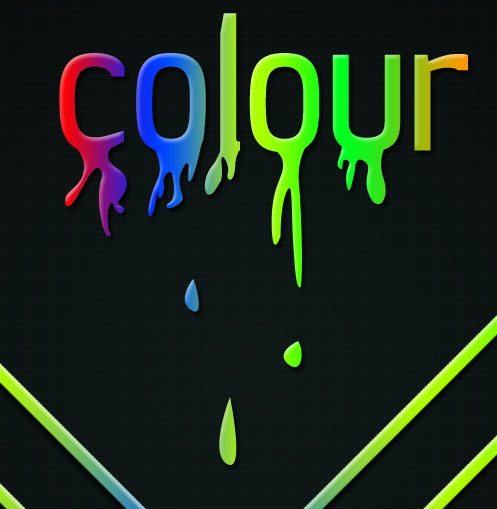
Now select the text layer and all of the drip layers and right click and choose “Rasterize Layers” this will make them all into pixels (if they are not already) now right click again and choose “Merge Layers” this will make them all one layer.

To add the same effects to the text as you have on the lines then find the original line that you made in the layers tab and right click and choose “Copy Layer Style” and then go back to the now merged text layer and right click and choose “Paste Layer Style”

With this done you will have something similar to below:

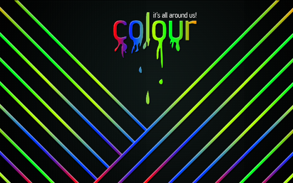
Now simply add a nice, relevant motto to the top right hand side of the text, I chose “It’s All Around Us” as the motto as I believe that it best describes colour at the minute as everywhere you look there is always some colour that stands out at you.
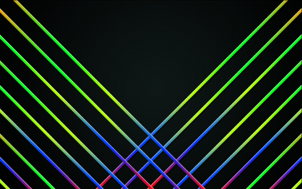
With all of the above steps completed you will have an image like the one shown below, and now only one more step to go and then we are done:

Step 7 - Adding An Overlaying Texture

To finish we are going to add a texture over the top of all of the layers so that it gives it some more depth and brings it more to life, the texture we are going to use is located HERE you may recognise this layer from a previous tutorial that I did on a retro grunge poster that has turned out to be very popular, with this in mind I thought I would use it in this tutorial, as also I think this particular texture definitely adds alot of depth to the image.

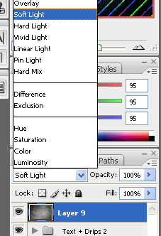
So once you have grabbed hold of the texture then open it up in Photoshop and drag and drop it into the wallpaper canvas, and resize and rotate if necessary so that you are happy with it and then with it selected change the layer style to “Soft Light”

With this done you should be left with the finished wallpaper as shown below:

It would be cool to see what you come up with so feel free to upload them to the Photoshop Tutorials Flickr Group and leave me a comment to say when you have uploaded one so people can comment on them,

And as always if you have any problems with this tutorial then don’t hesitate to leave me a comment or email me at: stevie489@googlemail.com and I will help you as much as I can…

The ‘Creativity’ Wallpaper

by Steve Tolley

This tutorial is possibly one of my favourites as I love the outcome, we are going to create a desktop wallpaper with a bit of a difference, we will use a range of techniques and most importantly we are going to use our imagination and creativity skills,

What We Are Going To Achieve

Step 1 - New Document

Create a new document that corresponds to the size of your desktop, mine being 1440 x 900, you can check yours by right clicking on your desktop and choosing Properties from the pop up list.

Step 2 - Radial Gradient Background

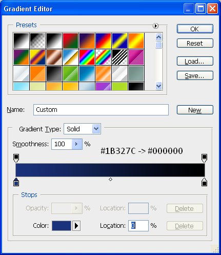
To start we are going to add a radial background to the canvas, to do this pick the gradient tool and make sure it is set to radial gradient (Top toolbar option) and then set your colours to the below:

With the gradient colours set then drag the cursor from the middle of the document to one of the outer corners in order to get a evenly distributed gradient like below:

Step 3 - Write The Text

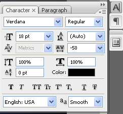
To get the effect so that the “Y” has fallen over you need to write the text seperate, so first of all write the word “Creativit” I have used the font MUSEO which can be found with a quick search in Google and then set the font spacing to “-50″ the font menu can be opened by going to Window > Character on the top toolbar then you can use the settings below:

When you have applied these settings then your text will look like that shown below:

When you have this, then you can write in the Y in a seperate layer, then simply choose the move tool and rotate the Y so that it looks similar to below:

Now that you have the basic layout, you can add some very simple blending options, to do this simply double click the desired text layer and make sure that the drop shadow is ticked and press OK, now do the same for the letter Y and you will have an outcome similar to below:

To add to the effect you can add a simple shadow as shown in the Realistic Shadows tutorial which makes it look as if it is sitting on a floor.

Step 4 - Adding The Spill

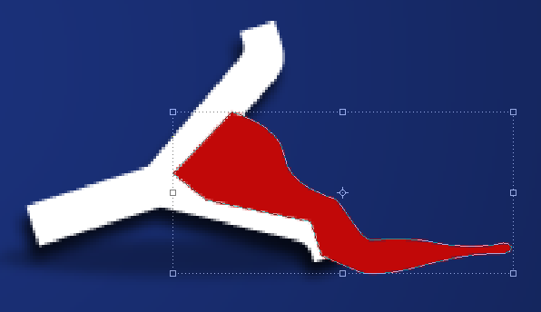
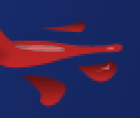
To add the spill make sure your foreground colour is set to a bright colour (I chose RED as that is the colour I wanted the final spill but you can use any colour) and then with the PEN tool selected draw a shape the same as below:

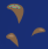
Now move this layer below the letter Y layer in the Layers tab so that it looks as if it is actually spilling out of the letter itself, now we can add the seperate splatters which are simply little shapes drawn with the pen tool, any shape can be drawn and any amount can be drawn it is up to you, also you can use the below image as a reference:

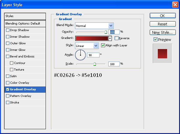
You can also add a gradient to the main spill and the little splatters to get a better effect and add more depth so you can add the Gradient below through the blending options menu:

To finish off the spill you can some highlights as shown below, these are made with the pen tool when the foreground colour is set to a lighter version of the original colour used:

When you have applied these highlights then you will have the finished spill like below:

Step 5 - Adding Broken Cables

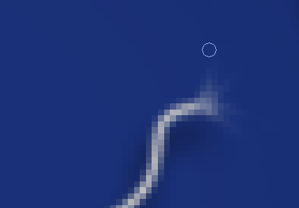
There must be a reason why the letter “Y” has fallen over and spilt the liquid inside…? Well there is the cables that hold it up have snapped, so in this step we are going to make those cables, first of all grab the pen tool and draw a simple path on the end of the horizontal bar on the letter “T” (shown below) once this has been done create a new layer (CTRL + SHIFT + N) and then right click the path you have just made and choose “Stroke Path” and then press OK this will make the path a line created by your brush, now do the same on the top of the letter “Y” and you will have something similar to below:

Apply a simple Drop Shadow through the Blending Options menu and also make sure the cables are white, so if they are not already white, then add a Colour Overlay also through the Blending Options menu and set the colour to white.

Once the cables are done then we need to make them look as if they are frayed at the ends, so they actually look like they have broken apart, to do this zoom into the end and then choose the Smudge tool from the toolbar (shown below) and simply drag away at the edges so you have something similar to below:

Now do the same to the other part of the cable, once you have done this you will have something similar to below:

Step 6 - Adding The Hat

This step is simple as it is just a case of getting the hat image and inserting it into the document and then positioning it in the right place,

So grab the HAT picture located HERE!

And open it up in Photoshop, when this is done drag it onto your wallpaper document and position on the top left of the letter “C” that is pretty much it as I have already rotated it to the correct angle, but it can be resized/rotated accordingly, when the hat is in place you will have the same as below:

Step 7 - Adding The Liquid In The “V”

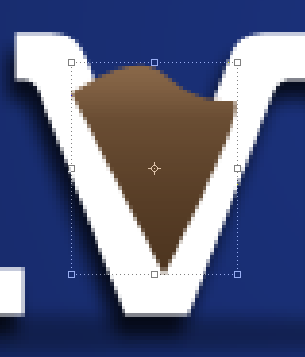
This step is very similar to Step 4 where we adding some liquid/paint to the inside of the letter “V” to do this set your foreground colour to any desired colour that you want and using the Pen Tool again draw a shape like below:

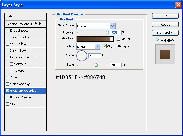
Now drag this layer below your text layer in the layers tab so it looks as though it is inside the letter, and then double click the layer and apply the below gradient (Change the colours if you want to):

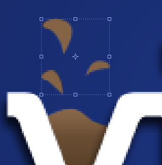
With this gradient applied create some liquid drops so it looks as though something has just fallen in it and splashed it everywhere, use the below image as a reference, once done apply the same gradient to all of these drops:

Now you can add the highlights again using the same methods as in Step 4, grab the pen tool and make a shape but make sure the foreground colour is set to a slightly lighter colour than what is on the drop itself, when this is done you will have something similar to below:

When this is done we will have something similar to below and will be left with one final step:

Step 8 - Adding A Slogan/Motto

To finish we are going to add a simple slogan/motto to the bottom right of the word “Creativity” so make sure your foreground colour is set to white and type the text “It’s Amazing What You Can Do…” or something similar and then open up the blending options menu and add a simple drop shadow you are then left with the below:

With this done we are finished, feel free to add more things to it, and experiment with different shapes and words and see what you come up with, if you create something then why not upload it to the “Photoshop Tutorials Flickr Group” so others can see what you have achieved

So now we are finished you should have something that looks like the below:

And as always if you have any problems with this tutorial then don’t hesitate to leave me a comment or email me at: stevie489@googlemail.com and I will help you as much as I can…