Color Grading a Flat Photo: What Works and What Doesn't
A flat, well-exposed photo is easier to grade than one that's already been processed. The work is in understanding what you're changing and in what order, not in finding the right preset.
What “Flat” Actually Means
A flat photo, in the context most digital photographers mean, is one that’s been deliberately underprocessed. Raw files shot with a neutral picture profile, log-gamma footage, or scans from a well-exposed negative all look flat: low contrast, muted colors, a histogram that sits in the middle rather than spreading to the edges.
Flat is good. It means you have information across the full tonal range. A photo that came out of the camera looking already punchy and saturated has likely had contrast added and highlights clipped in-camera, which means some of that information is gone before you even open it. A flat file gives you maximum latitude to decide where the contrast goes and how the colors behave.
The goal of color grading isn’t to add saturation until the photo looks exciting. It’s to place tones and colors in the right relationships to each other so the image reads the way you intend it to. That’s a more controlled operation than it sounds.
Start With Exposure and White Balance
Before any creative grading, the technical foundation needs to be right. Exposure first: if the overall brightness is off, every subsequent adjustment is trying to correct for it. A Levels or Curves adjustment to set the white point and black point correctly takes thirty seconds and saves you from chasing color casts that were actually just overexposure.
White balance second. A color cast in the raw file contaminates every color decision you make on top of it. A portrait graded with the wrong white balance will look stylized in the wrong way: not the cool-shadow warm-highlight look you were going for, but just wrong skin tones with a layer of treatment on top.
If you’re working on a raw file opened as a Smart Object, fix both in Camera Raw before you start adding adjustment layers. If you’re working on a JPEG or a merged pixel layer, a Curves adjustment targeting the individual R, G, and B channels will let you neutralize a cast without affecting overall brightness.
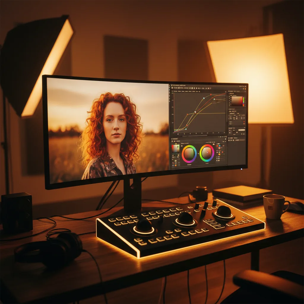
Curves Is the Primary Tool
Most color grading in Photoshop runs through Curves. It’s worth spending time here rather than reaching for Hue/Saturation, Color Balance, or Vibrance first, because Curves can do everything those tools do and it gives you more precise control.
The master Curves channel controls overall brightness and contrast. An S-curve is the classic contrast boost: pull the shadows slightly down and the highlights slightly up, and you increase separation across the tonal range. The steeper you make the S, the more contrast you add. A very steep S-curve produces the crushed-blacks, blown-highlights look common in commercial and fashion work. A gentle S is more natural.
The individual R, G, and B channels let you shift the color temperature and add tints to specific tonal ranges. Lifting the blue channel in the shadows while pulling it down slightly in the highlights gives you the cool-shadows warm-highlights split that reads as “cinematic.” Pulling the red channel down in the highlights desaturates skin tones in a way that looks less processed than reducing overall saturation. Adding a small amount of red to the shadows warms them without touching the rest of the image.
This split-toning through individual Curves channels is more precise than the dedicated Split Toning tools in Lightroom or the Color Balance adjustment in Photoshop, because Curves lets you draw the exact shape of how the effect transitions across tones.
The Order of Operations
Color grading adjustments interact with each other, so order matters.
Exposure and white balance first, before anything creative. Contrast second: establish the overall tonal structure before you start adjusting color, because adding contrast shifts color saturation (higher contrast makes colors appear more saturated, lower contrast makes them look flatter). Color work third: once the tones are right, you can adjust hues and saturation against a stable baseline. Any localized adjustments, dodging, burning, targeted color corrections, last.
If you add a saturation boost before you’ve set the contrast, and then add contrast afterward, you’ll often end up over-saturated because the contrast increase added apparent saturation on top of your deliberate increase. Doing contrast first means your saturation adjustment is working on the final tonal structure.
What Hue/Saturation Is Actually Good For
Hue/Saturation is a blunt instrument for overall saturation but a precise one for selective color work. The dropdown menu at the top lets you target a specific color range: Reds, Yellows, Greens, Cyans, Blues, Magentas. Used this way, you can shift the hue of a blue sky without touching anything else, saturate only the skin tones, or desaturate the greens in a background that’s competing with the subject.
The Targeted Adjustment tool (the hand icon) inside Hue/Saturation lets you click directly on a color in the image to select it. Drag left to desaturate, right to saturate. This is faster than guessing which color range your target falls into, since many real-world colors sit between the named categories.
The lightness slider in Hue/Saturation is worth avoiding. It affects the entire selected color range uniformly, which tends to look flat. If you want to darken or lighten a specific color, a Curves adjustment or a luminosity mask is more precise.
Luminosity Masks and the Limits of Global Adjustments
Global adjustments treat every pixel the same regardless of its position in the tonal range. A Curves adjustment you intend to affect only the highlights will also shift the midtones and shadows unless you constrain it.
Luminosity masks solve this by selecting pixels based on how light or dark they are. A highlights luminosity mask selects bright pixels at full strength and falls off smoothly into the midtones, with shadows nearly unselected. Run your Curves adjustment through that mask and it applies most strongly to the highlights and fades out toward the shadows, which is exactly what “highlight adjustment” should mean.
Building luminosity masks manually from Lab channels or using a panel that generates them automatically both work. The important thing is knowing they exist. They’re the mechanism behind the kind of tonal control that makes a grade look integrated rather than applied.
Presets Work Until They Don’t
Film emulation presets, VSCO packs, Lightroom presets imported into Camera Raw: all of these are legitimate starting points. They encode color decisions that real photographers and colorists made for specific film stocks, light conditions, and aesthetic targets. Using one as a starting point isn’t lazy. Starting and stopping there is.
The problem with applying a preset and calling it done is that it was designed for some other image. Its contrast assumptions fit a different exposure, its color shifts work best with a different white balance, its shadow treatment was designed for a different subject. Applying it wholesale produces results that vary from “looks pretty good” to “completely wrong for this image” depending on how closely your photo matches the preset’s target conditions.
Use presets to find a direction, then adjust from there. If the preset adds too much contrast, back off the Curves. If the color shift is right but too strong, reduce the opacity of the adjustment layer. If the shadows are too warm, adjust the blue channel. The preset got you to a starting point in ten seconds. The adjustment gets you to the result you actually wanted.
That’s the arc of most color grading work: establish the technical baseline, apply the creative intention, then refine until what you see matches what you were going for. The tools are precise enough to get there. The question is just whether you understand what each one does.